Branding & Logo Design
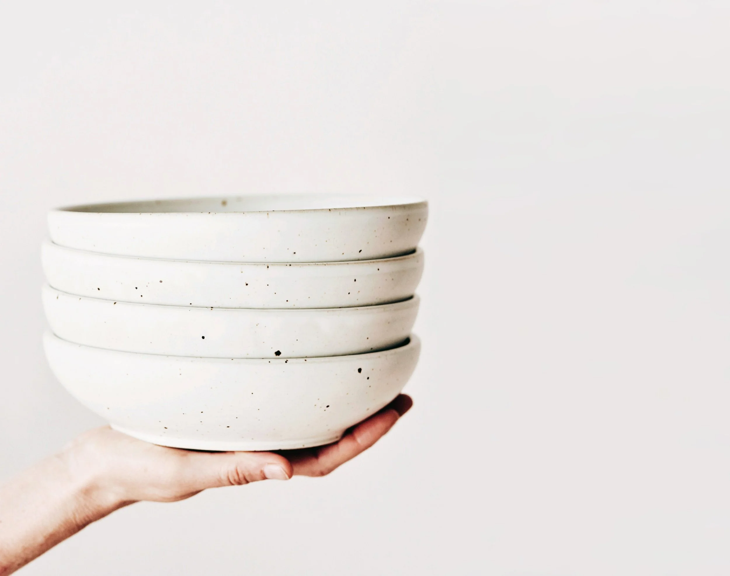
Art Direction and Product Design
Seasonal Color Palette Direction
Social Media Content Creation
Digital Marketing Campaigns
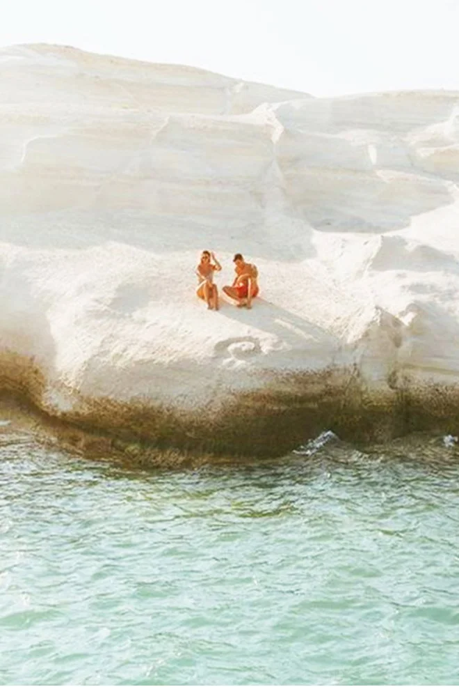
Photography, Styling & Photo Editing
Website Design
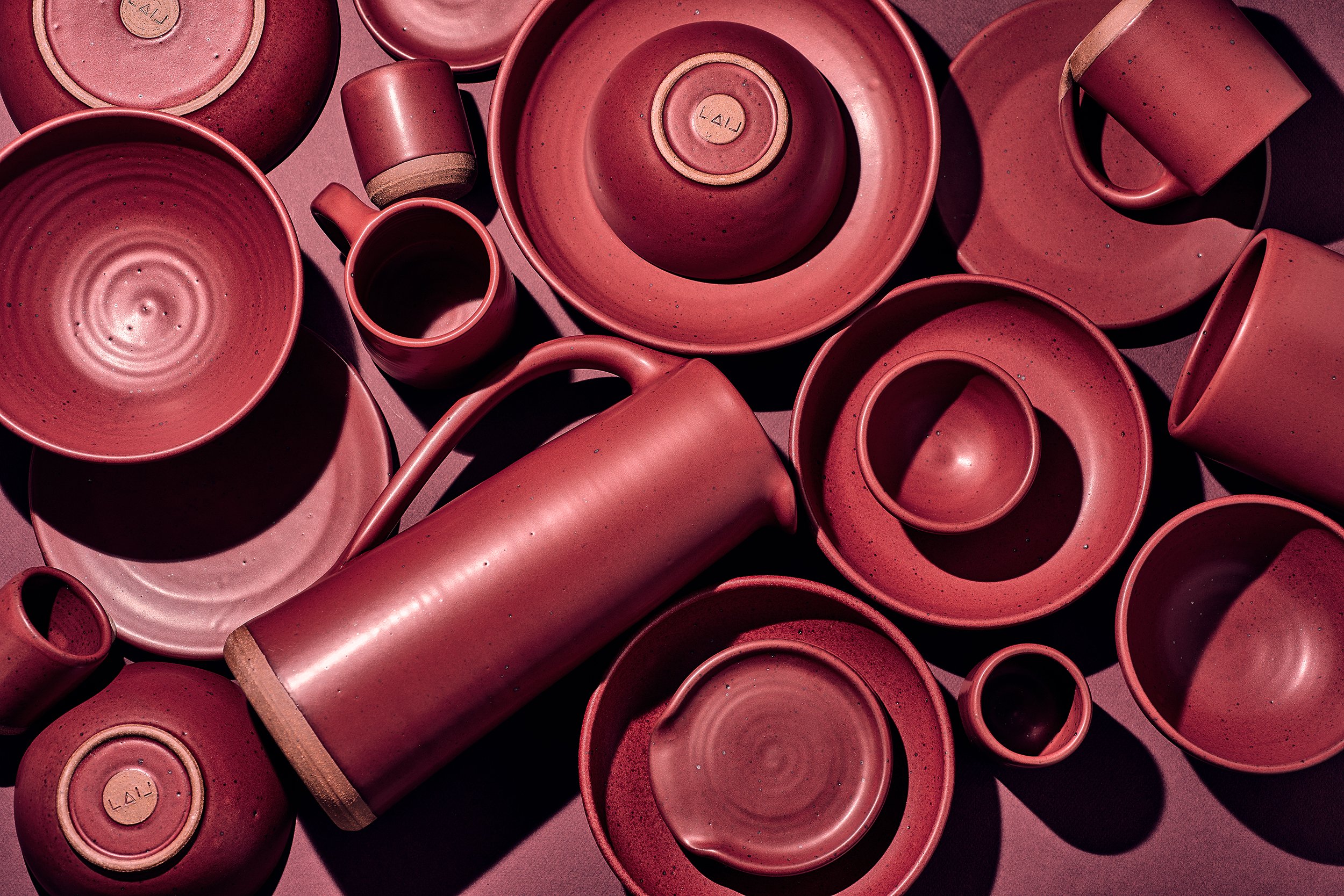
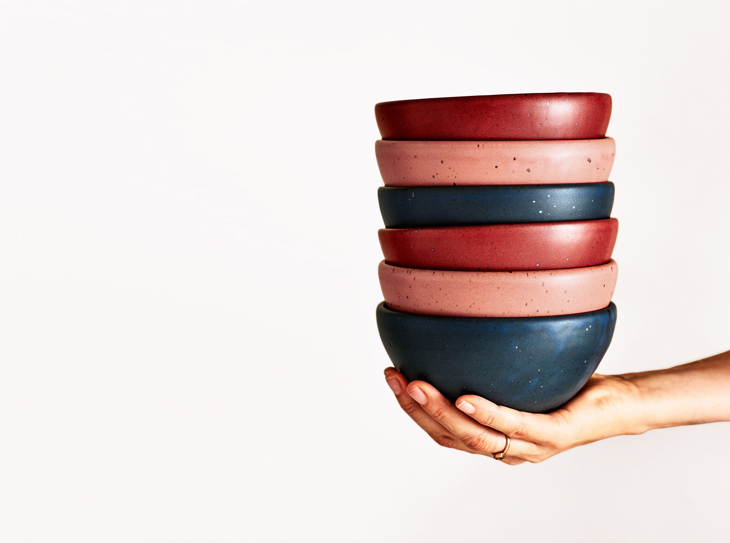

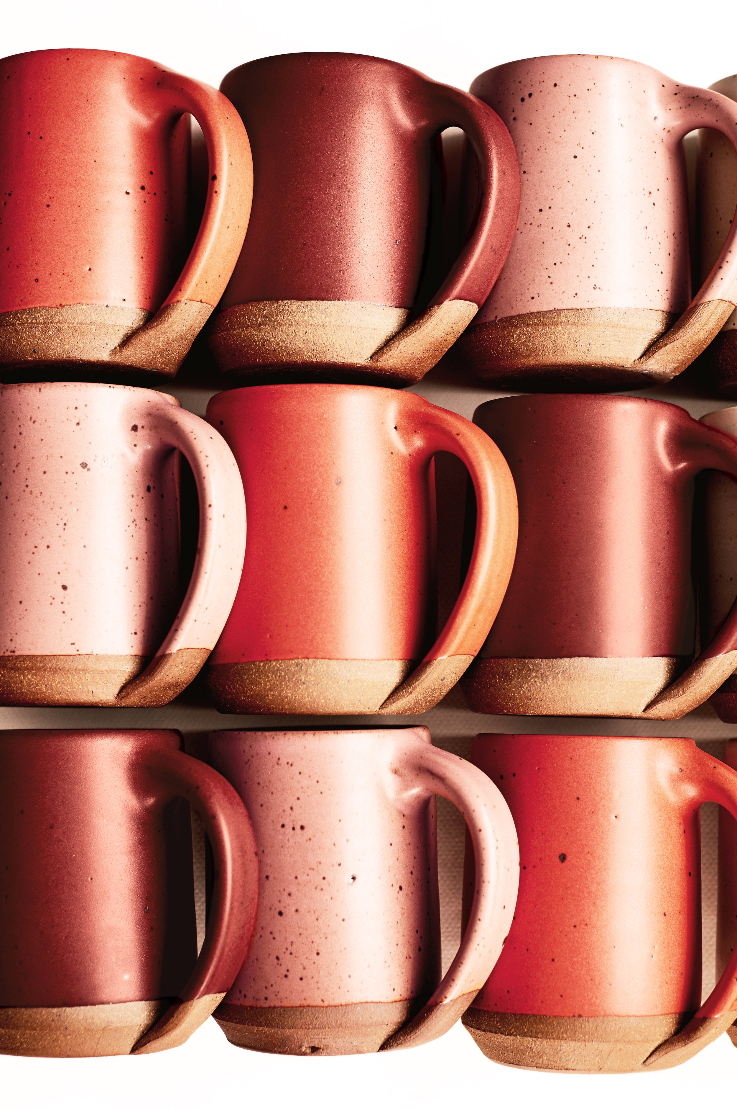

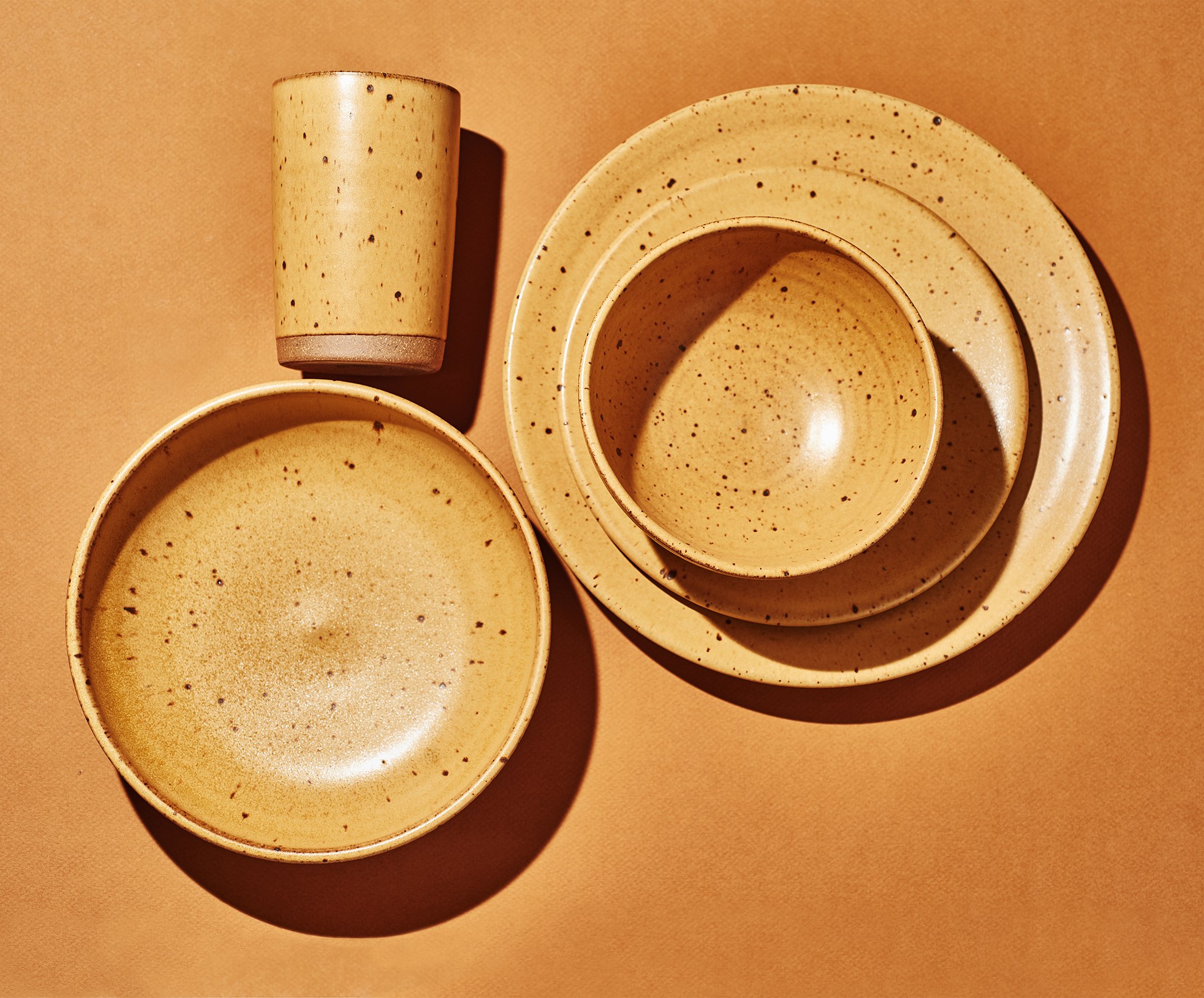
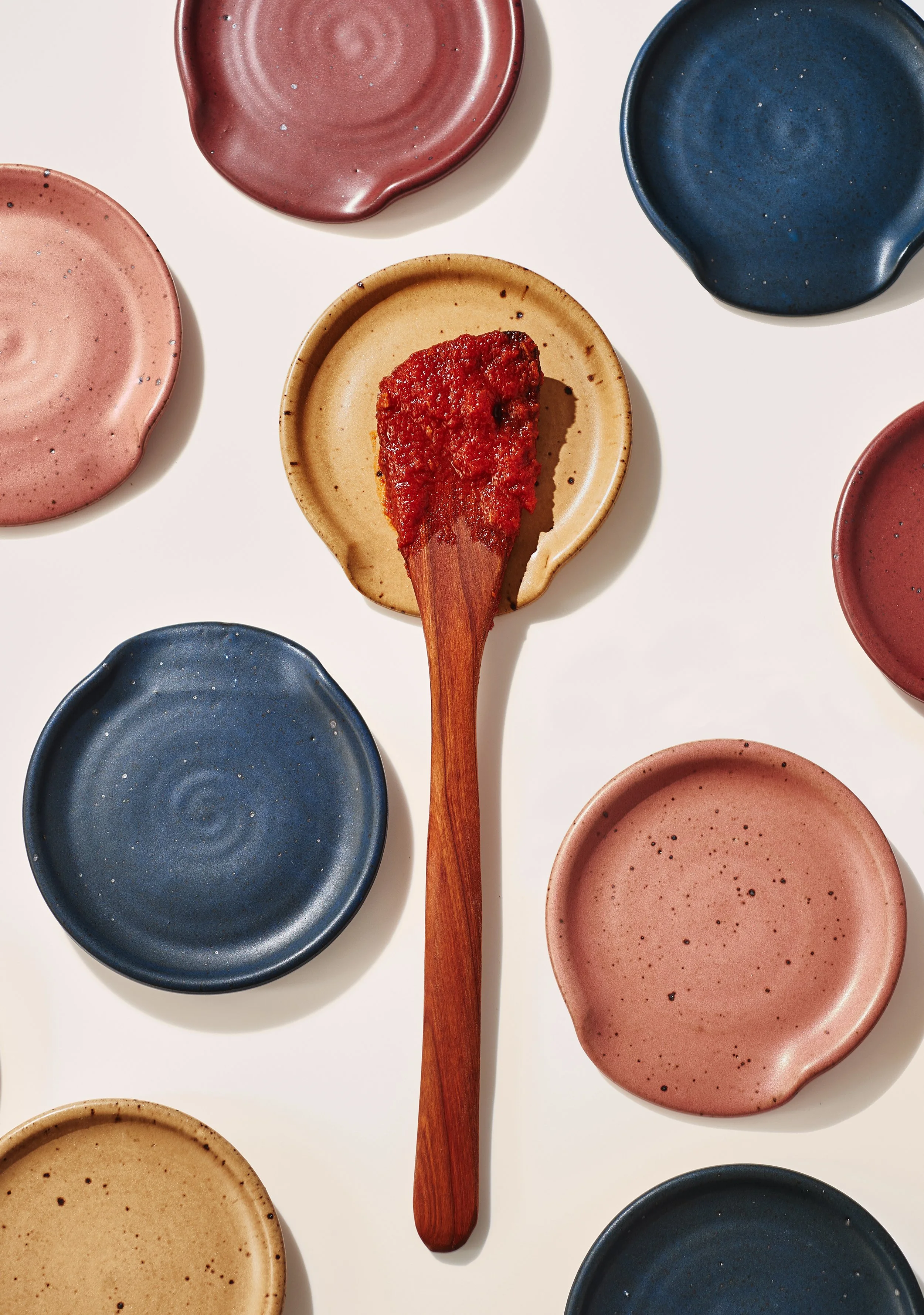

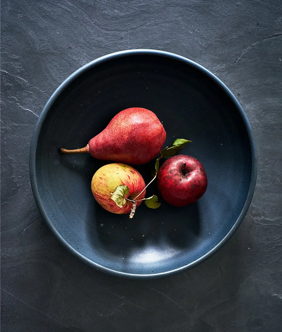

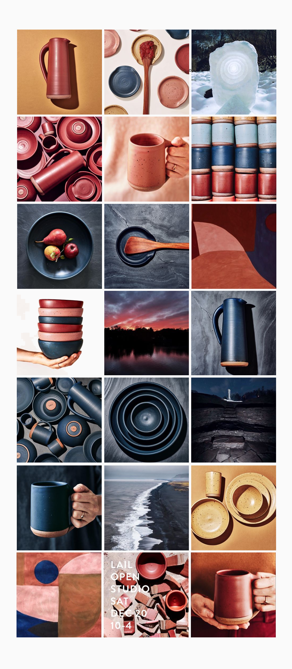
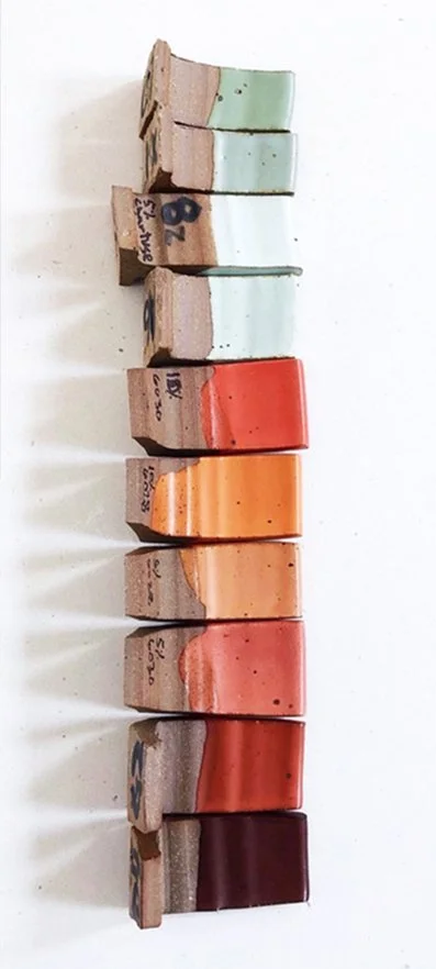
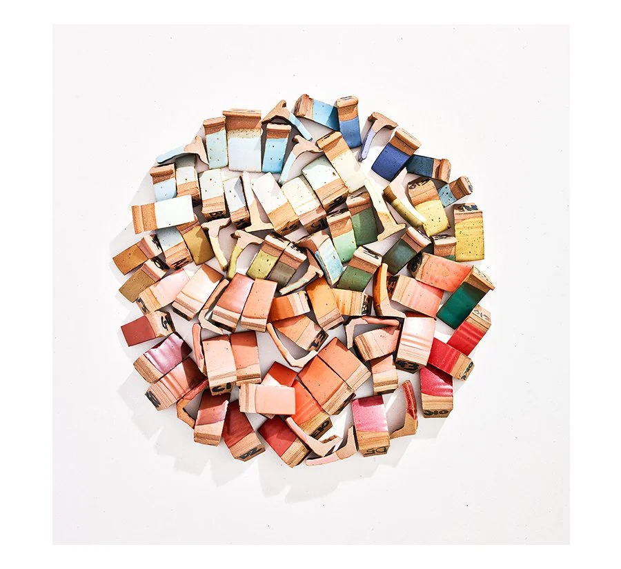
As Cofounder and Art Director of Lail Design, I guided the brand's evolution through deliberate visual storytelling—translating form, color, and texture into a distinctive identity. I crafted seasonal color palettes and directed all product photography, employing flatlay composition and chromatic contrast to create compelling vignettes for digital channels. My work extended from foundational brand elements—logo design and the signature clay stamp—to the nuanced integration of glaze texture throughout our graphic language, ensuring coherence across every customer touchpoint
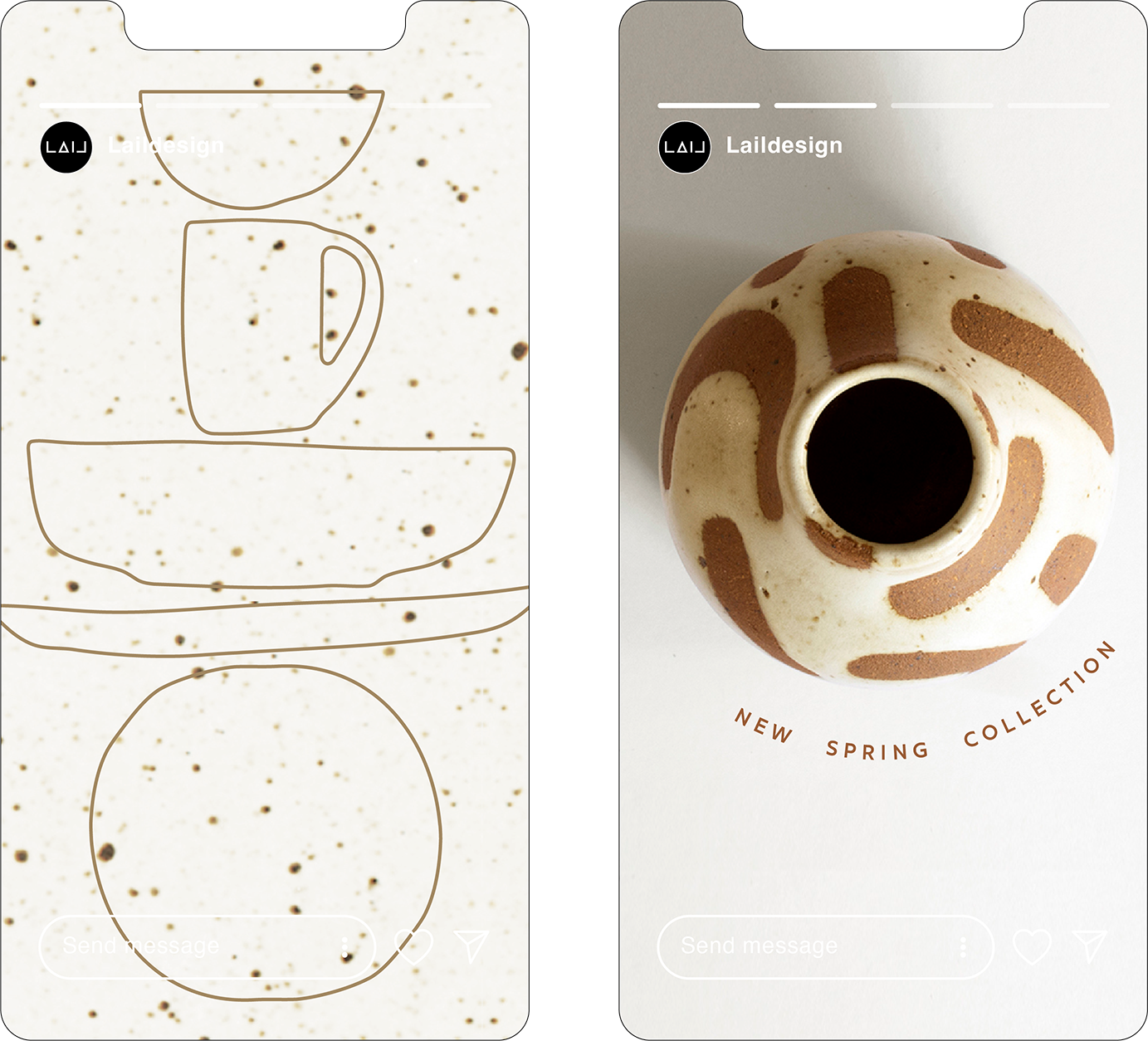
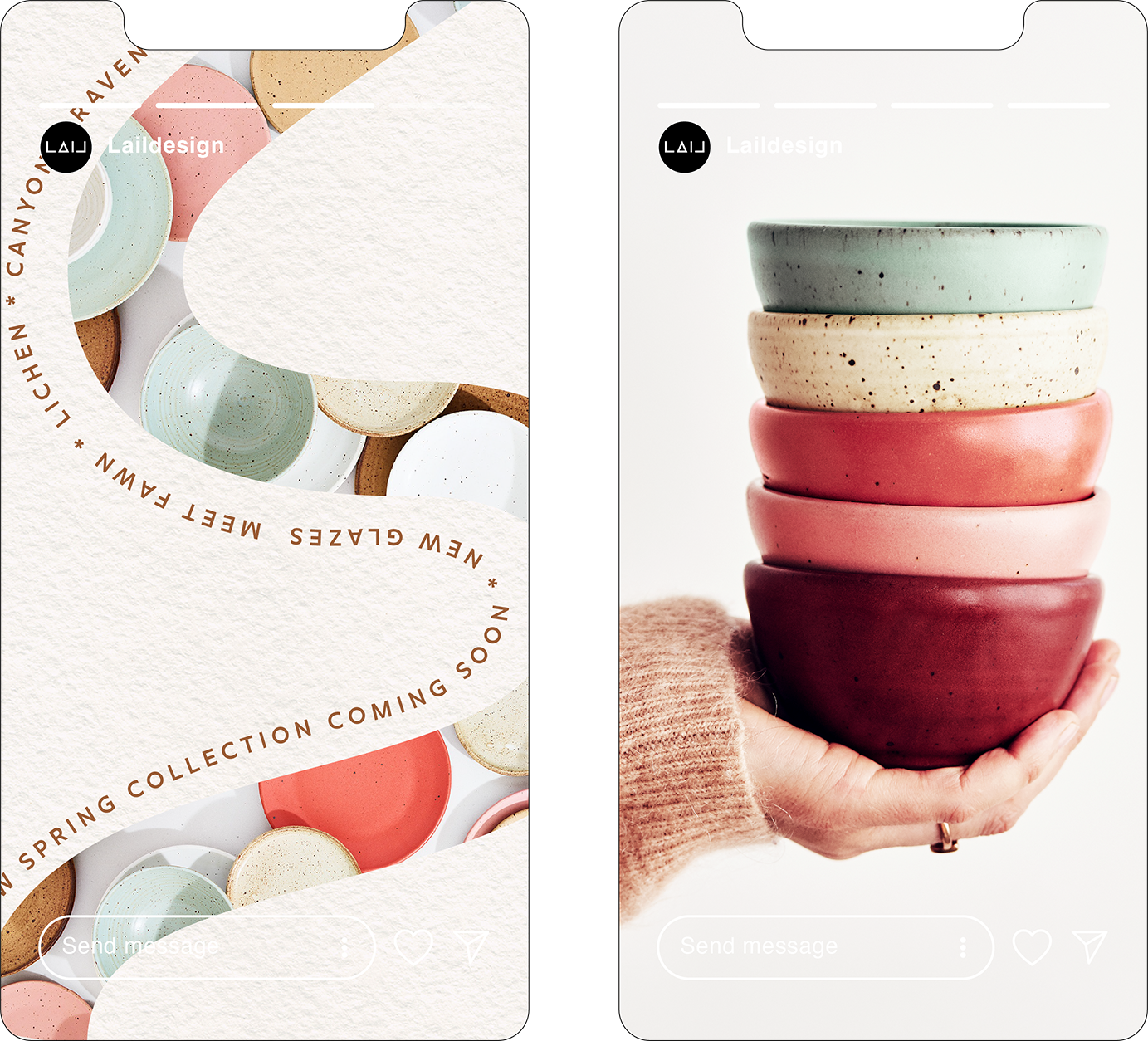

The Spring palette celebrates the optimistic hues of bursting blooms, rippling water, and earthy sands. I looked to the sun-baked oranges of Bryce Canyon and paired them with the cool mint greens of lichen thriving on our Woodstock property. Our golden neutral glaze takes its name from the fawns that populate Upstates woodlands and meadows.


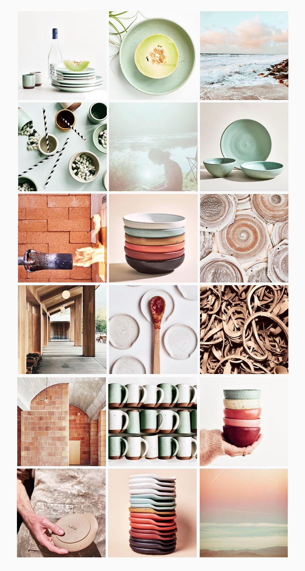
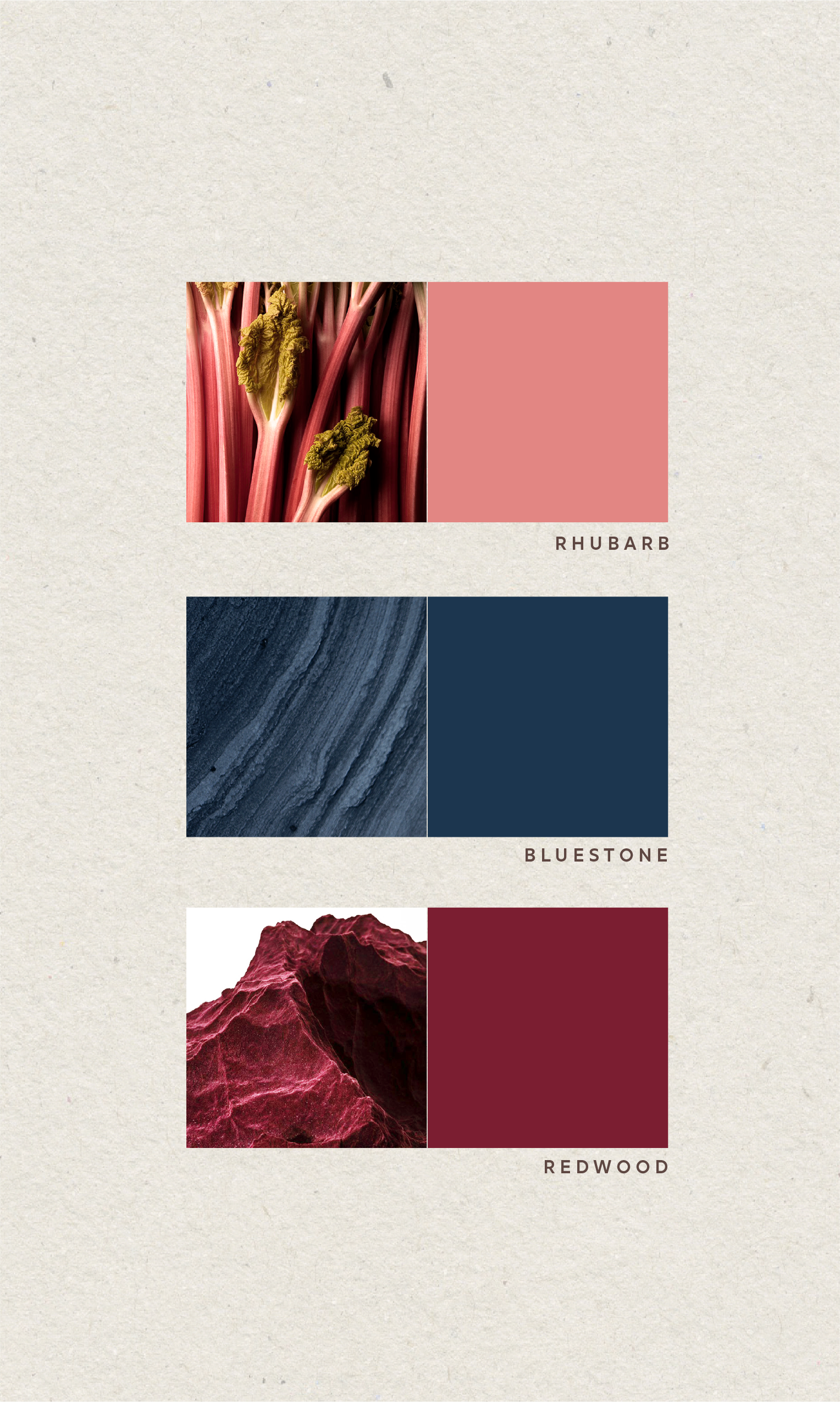
Fall transformed into a deeper, more opulent palette of stony blues, stewed pinks and sultry burgundy. The resulting collection is a rich celebration of winter's moody sky- scapes, taking inspiration from nightfall settling over a desolate landscape. The names nodded to local bluestone in the area, and the deep pink of rhubarb and harvested fruits.