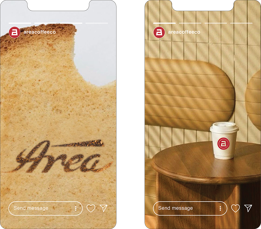
Area Coffee
Logo Design
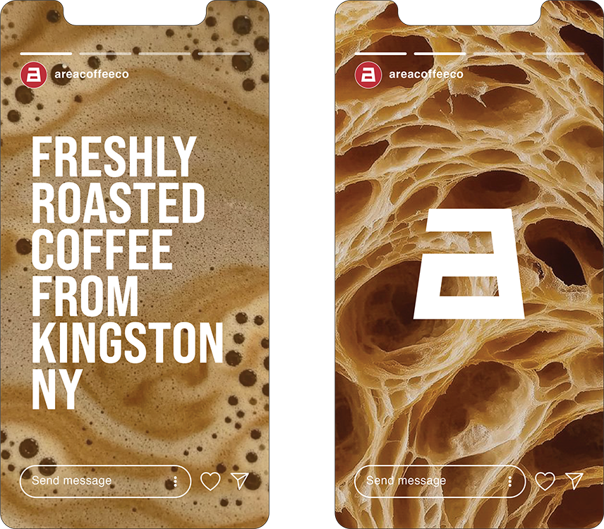
Kingston, N.Y
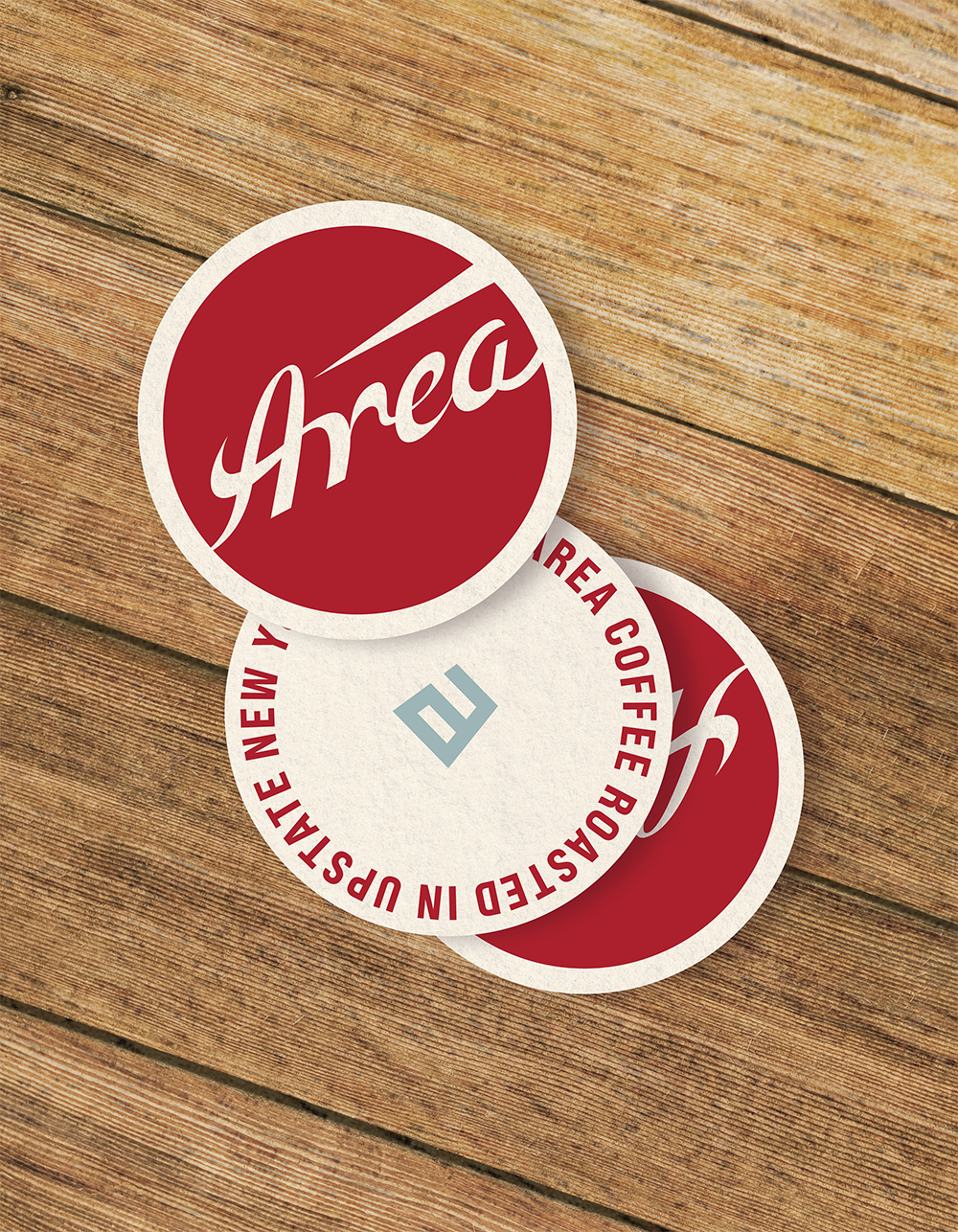
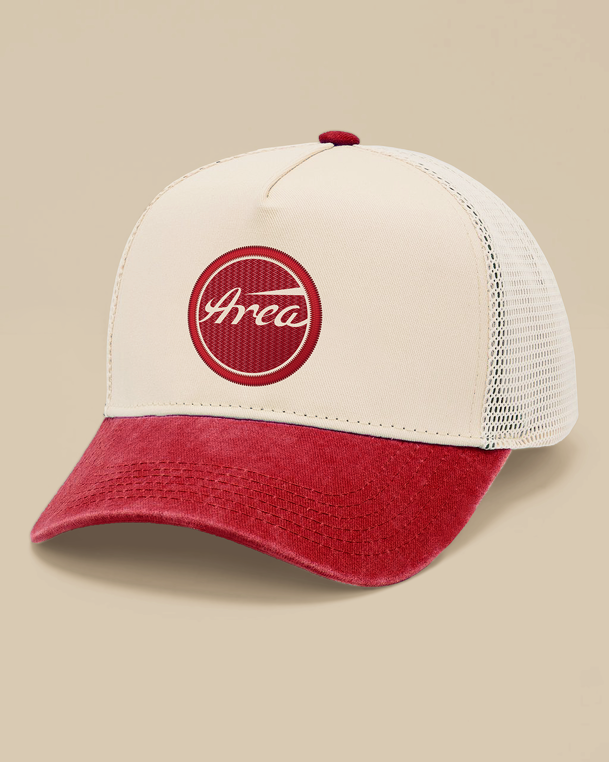
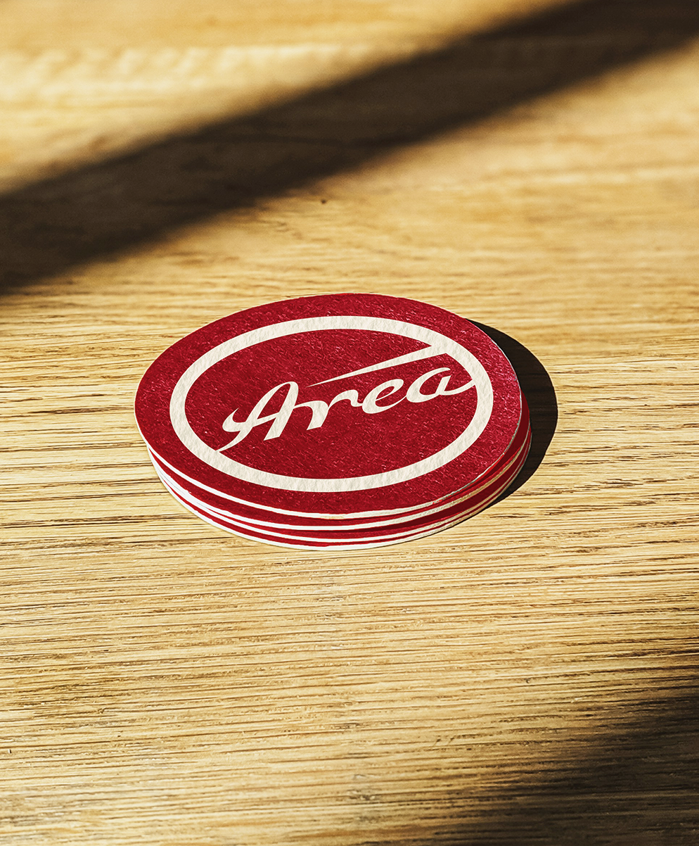
Logo Design
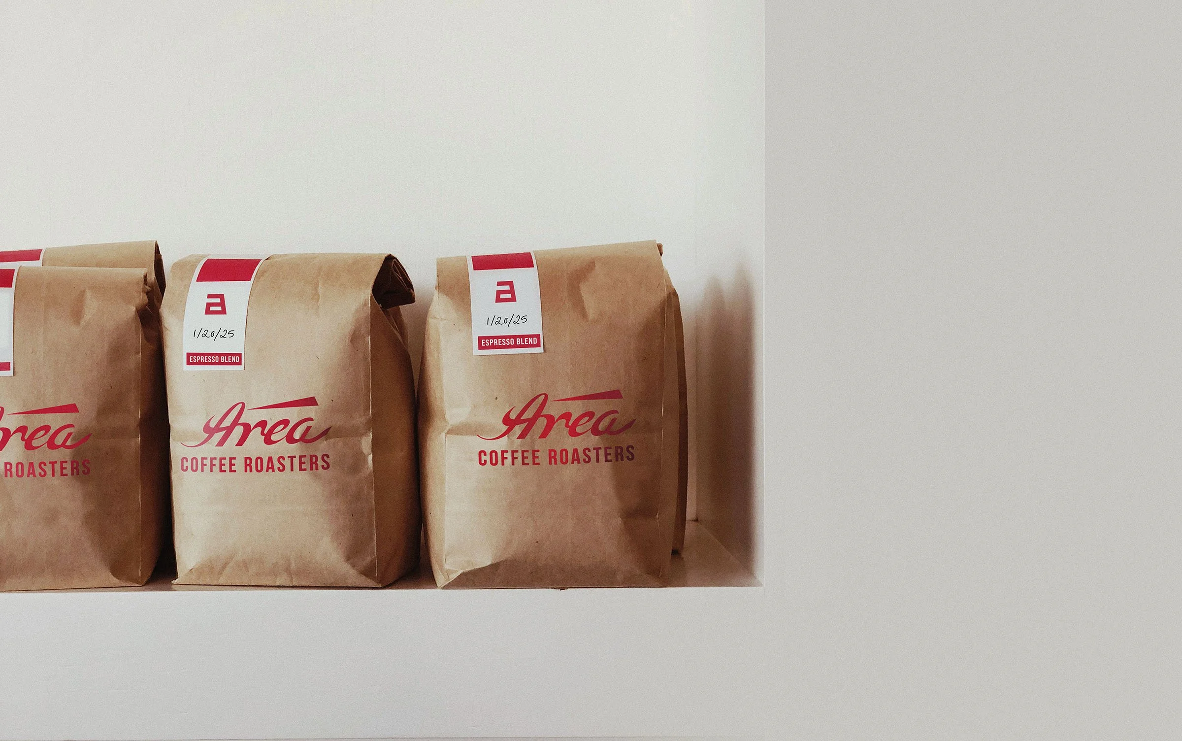
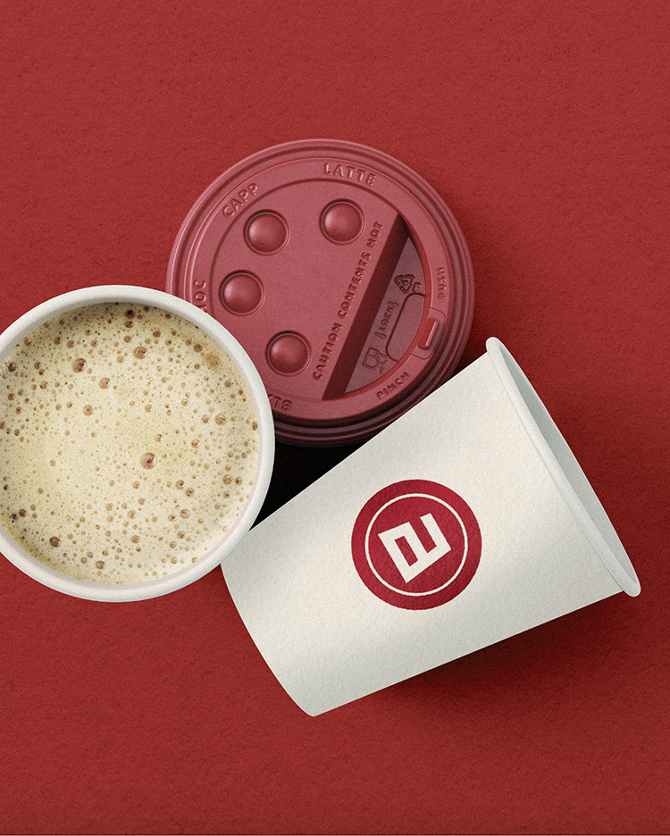
Packaging Design
Color Palette
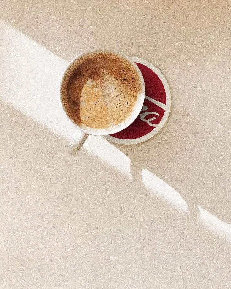
Storytelling