
Re-thinking search filters for the dating app bumble.
-
Student Project – User Research, Problem Solving, Feature Design
-
Adding a feature to an existing product.
-
4 Weeks | 80 Hours
-
Figma, FigJam, Photoshop, Illustrator, Zoom, Discord.
Background
Living in a small community and being a single parent, I found using dating apps an increasingly frustrating experience- seeing the profiles of people from my child’s school or people from local businesses made me feel uncomfortable, especially knowing that they too could see my personal information.
I began asking friends who were dating if they were also experiencing this level of discomfort, and the answer was a resounding yes. The more I asked around the more I was hearing how awkward this was, especially for single parents, who prefer to keep their personal lives private for many reasons, mostly to avoid putting themselves and their children in awkward situations.
I wanted to investigate if a feature that removed the inner radius of profiles (like a donut) could help to solve this problem. I chose the platform Bumble, primarily because it posits itself as a female forward dating app, attempting to redress gender role inequities in the dating sphere.
Bumbles founder & CEO Whitney Wolfe Herd
“When I founded Bumble, it was because I saw a problem I wanted to help solve. It was 2014, but so many of the smart, wonderful women in my life were still waiting around for men to ask them out, to take their numbers, or to start up a conversation on a dating app. For all the advances women had been making in workplaces and corridors of power, the gender dynamics of dating and romance still seemed so outdated. I thought, what if I could flip that on its head? What if women made the first move, and sent the first message?”
Bumbles core values highlight the safety of women, and vulnerable populations, by promoting an atmosphere of respect and equality. They recently introduced features that prevent unsolicited nude photographs, and premium subscriptions offer more nuanced features such as ‘travel mode’ and ‘incognito mode’.
Bumbles founder & CEO Whitney Wolfe Herd
“Since 2017, the #MeToo and #TimesUp movements have put sexual harassment and gender discrimination at the center of the cultural conversation. I’m more dedicated than ever to helping advance gender equality — and putting an end to the misogyny that still plagues society. We don’t tolerate hate speech or bad behavior of any sort.”
Next I compared bumble’s features with those of other popular dating platforms, and then moved forward with user interviews to further clarify the problem, and understand the pain points of dating in a small community.

Design Process
-
![]()
1. EMPATHIZE
Competitive Analysis
User Interviews
Online Dating Research
-
![]()
2. DEFINE
Interview Synthesis
Persona Creation
Storyboarding
-
![]()
3. IDEATE
Sketch Features
Bumble Architecture
Feature Task Flows
-
![]()
4. PROTOTYPE
Copy bumble UI elements
High-fi Mockups
Final Prototype
-
![]()
5. TEST
Usability Testing
Feedback Synthesis
Iterate


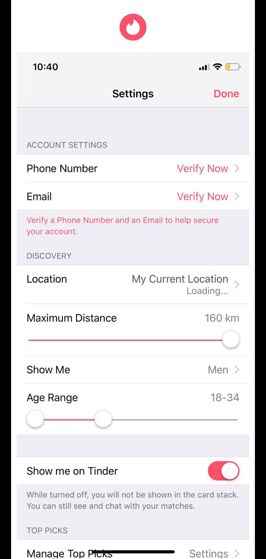
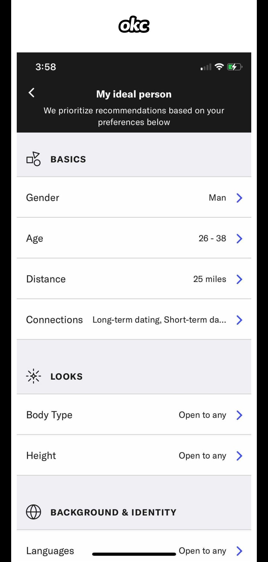
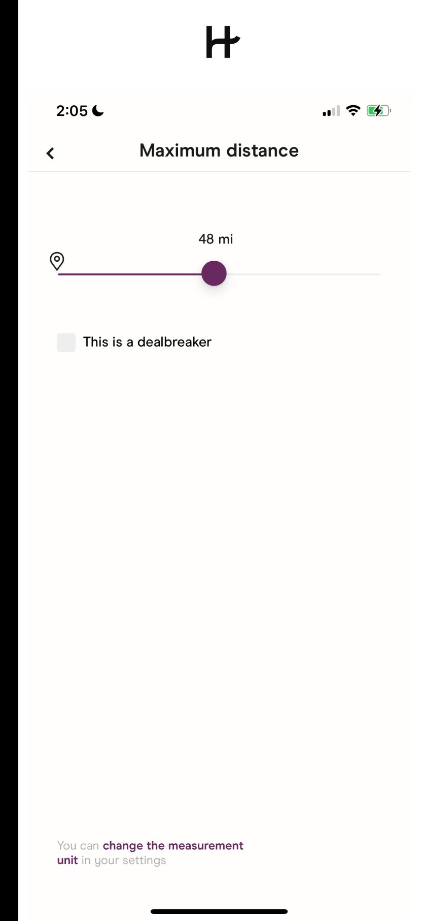
Competitive Analysis
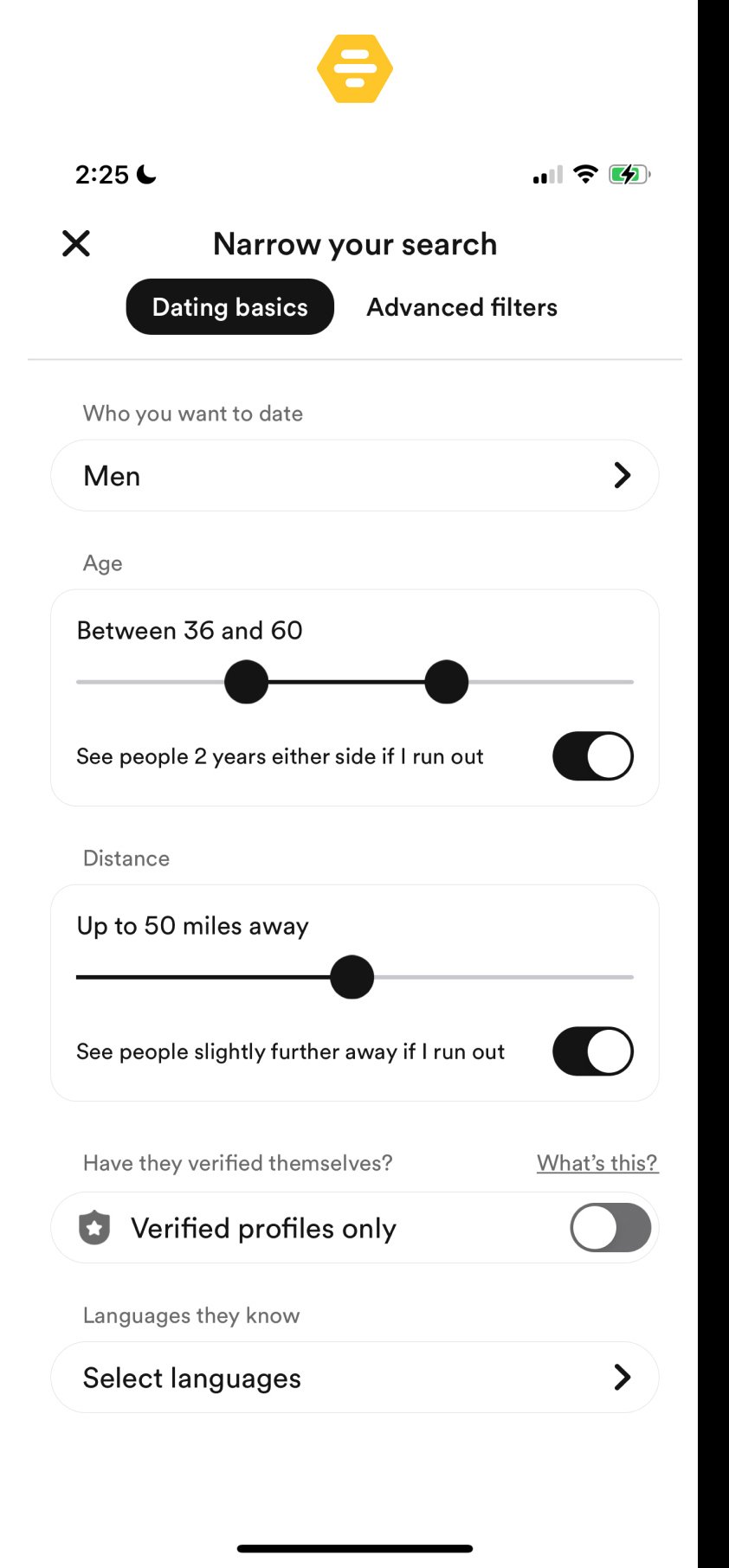
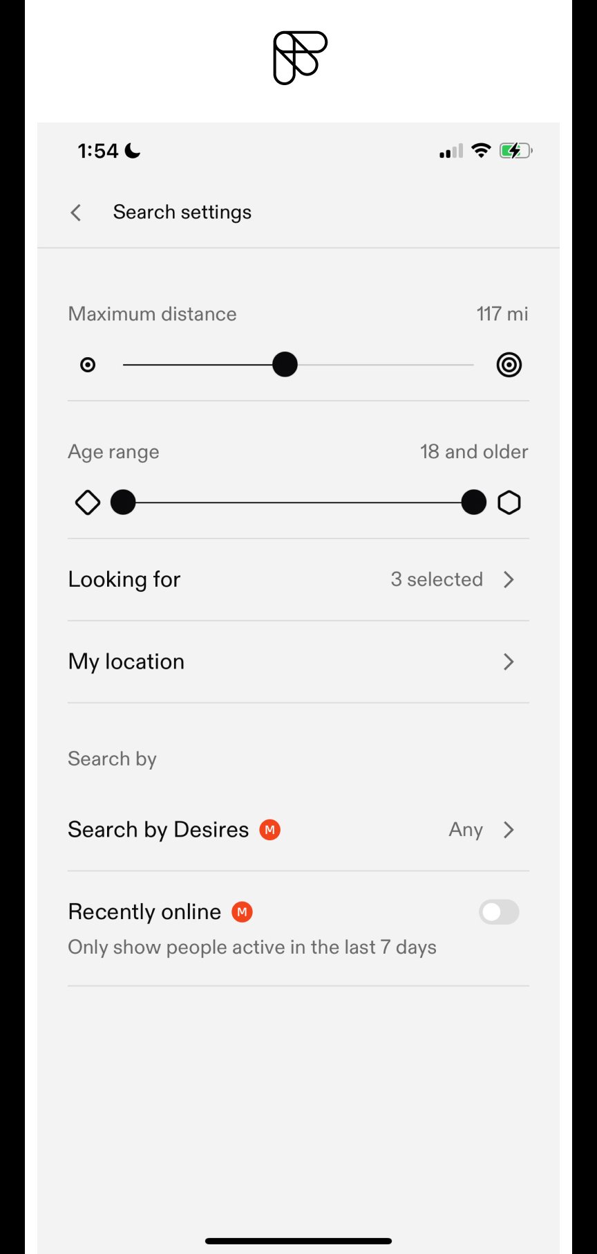
Comparing 5 popular dating apps (Tinder, Hinge, Bumble, Feeld, & Ok Cupid), I focused on their distance range features. All of them use a slider bar to set a range of search, except Ok Cupid which had a fly out menu with distances to select from. I did some exploration on different styles of components, and experimented with some circular sliders, but ultimately decided these would be more confusing for the user. The linear slider is effective, and is what the user is already used to seeing.
User Interviews, Key Takeaways
I interviewed 7 people- 5 women and two men all above the age of 30, 5 out of the 7 are parents. All are single and currently using dating apps to meet people for varying degrees of connection. My target user group is an older generation of online daters, predominantly heterosexual women with children, specifically those living in smaller communities.
I wasn’t able to find as many men to interview as women, so the responses are mainly from a female perspective, however given that bumble posits itself as a female first dating platform I didn’t see this as an issue. This is not to say however that more privacy and nuanced control over who can see your profile isn’t a priority for other genders and the LGBTQ community, if I had more time I would interview a wider group of participants.
Focusing the bulk of my user research on people living in small communities, I also included two participants who lived in NYC, and one who split their time between a small town and NYC. My theory was that a sense of anonymity would be less attainable and more of a priority to my users in small communities vs those in larger metropolitan areas.
“ Being the mother of two young children, I don’t want local people who know where I live, to also know that I am single ”
5/7 people I spoke to did not want people they knew, or people in their immediate locale to see their profiles.
4 people I spoke to cited privacy and safety as the number one reason for not wanting to date people nearby.
3 people mentioned that they didn’t want to date people who were local, for fear of having to see them repeatedly after an awkward or failed date.
“ I don’t want to go on a date with someone local, and see them everyday for the rest of my life after one awkward cocktail ”
1 person mentioned the impracticality of the ‘dating radius’ and would like to control the distance filter more directionally to align with her long commute.
6/7 people had seen people they knew from their community on the apps. The only person who hadn’t was the participant based in Brooklyn NY.
“ When I saw someone I knew on there, it freaked me out a little , I knew that they were probably seeing my profile too “
All participants had frustrations with dating apps, but a lot of these frustrations were more to do with human and social problems than the algorithms or feature limitations of the apps. They fell along the lines of inconsistent profiles, dates falling through, or not finding suitable people to date.
1 person I spoke to said he would use the ‘donut’ locally in the small town where he resides part time, but not when he is in the city on business.
All participants when asked if they would pay for a premium tier on a dating app, said that they would not.
“ I don’t want to date anyone who is 90 miles away, unless they live in the same direction as my commute ”
As predicted the participants that I interviewed who lived in a small town, and who also had children were enthusiastic to remain anonymous. They didn’t want to date in their immediate community for fear of awkward situations and for people whom they did not want viewing their dating preferences and personal information.
The two city dwellers I interviewed didn’t experience the same issues with seeing people they knew on the platform, furthermore the interviewee who split time between the city and small community, echoed this sentiment, but did express that he wanted more privacy when not in the City.
Additionally the research revealed how the search feature on all of the platforms only performs a radial search, and that some users may have need for more control over direction vs radius.
From Insights To Design Solutions
OPTION 1. ‘THE DONUT’
The primary feature idea was the ‘donut’ search, omitting the center zone up to 10 miles. However my research uncovered some other problems that my target group faces so I continued brainstorming other features that could be complimentary.
OPTION 2. ‘THE MAP’
Parents lifestyles can get complicated fast, and involve many commutes weekly, in this scenario a linear route search could be more effective. A user may want to search 30 miles in one direction but not radially.
OPTION 3. ‘THE BLOCK’
Another issue I kept hearing was not wanting to see exes or work colleagues on the app. A feature to screen for users via email could mitigate some of this visibility provided the emails are known.
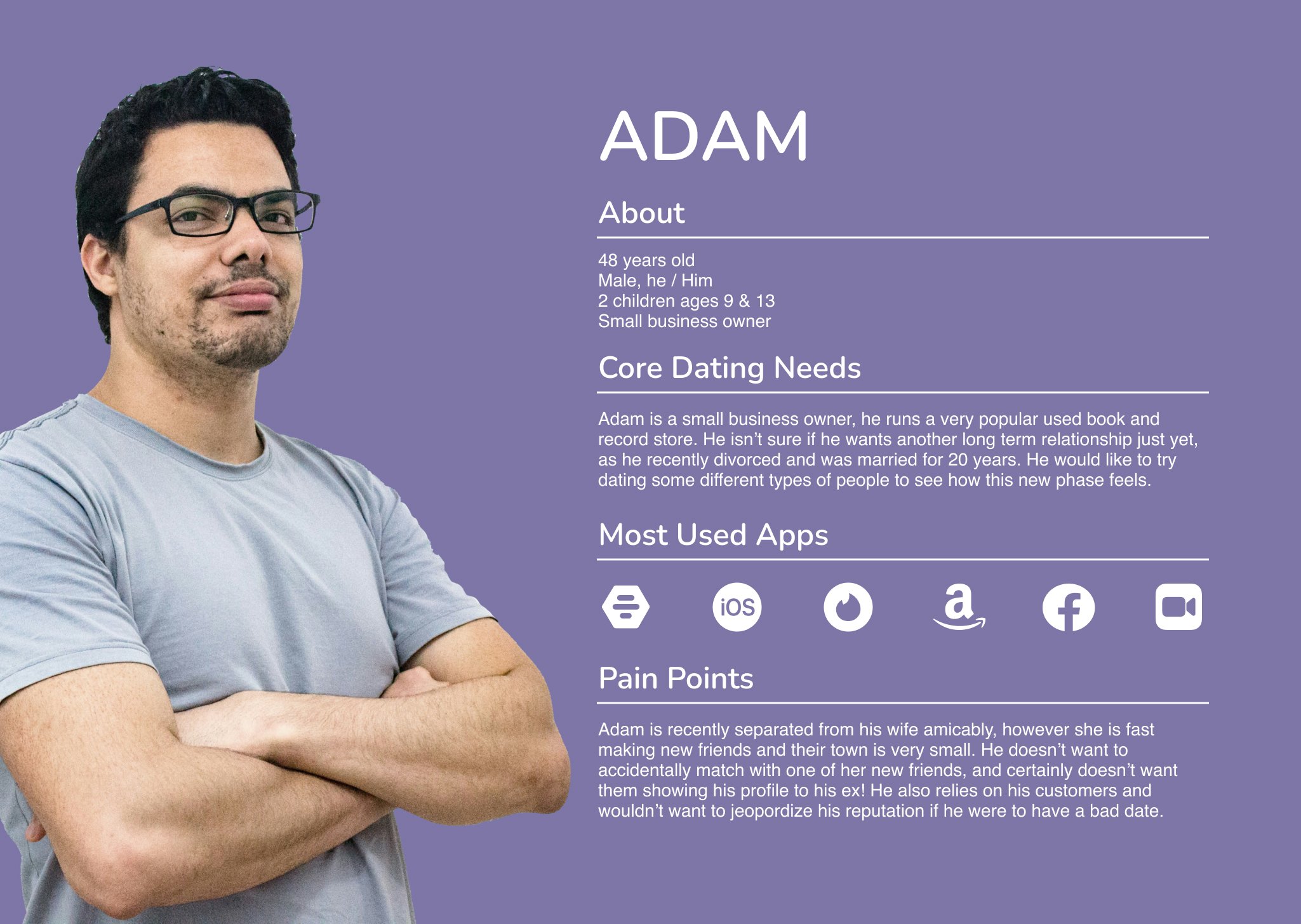
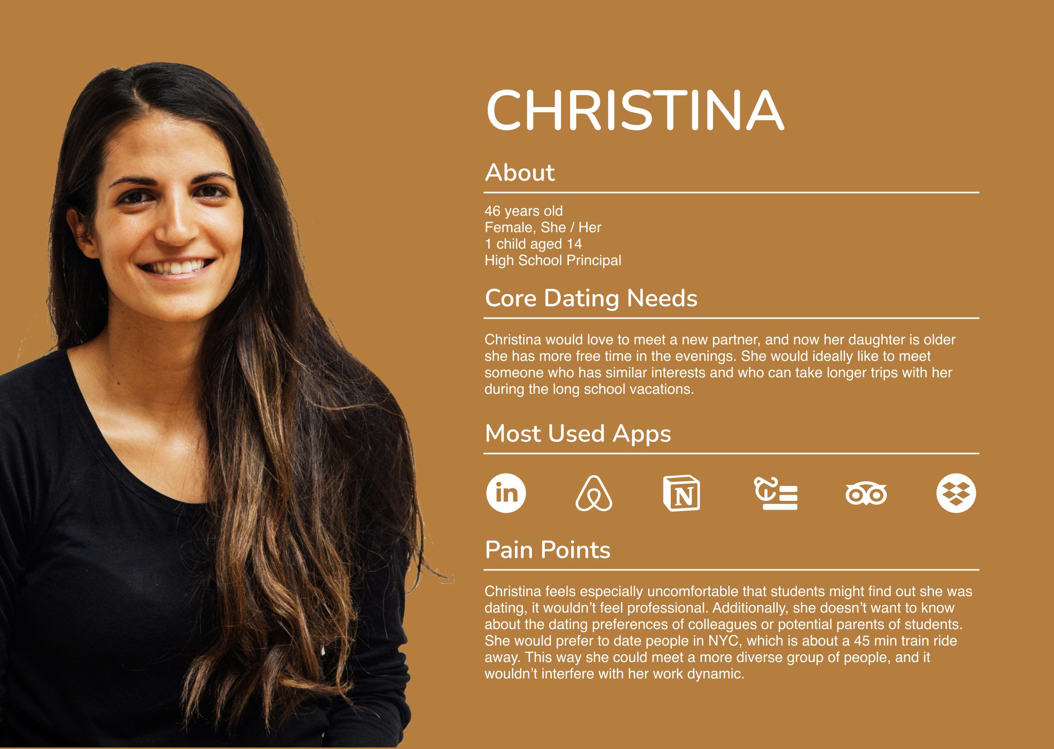
Personas
With the user research information in mind, I created some personas to help reflect on and understand the problems my user group faces. Each of the personas are ‘middle’ aged and reside in small towns. They all hold public facing positions in the community that require a level privacy in their personal lives. The personas enabled me to further visualize the pain points, and play out if the features I had in mind would help solve the problem.
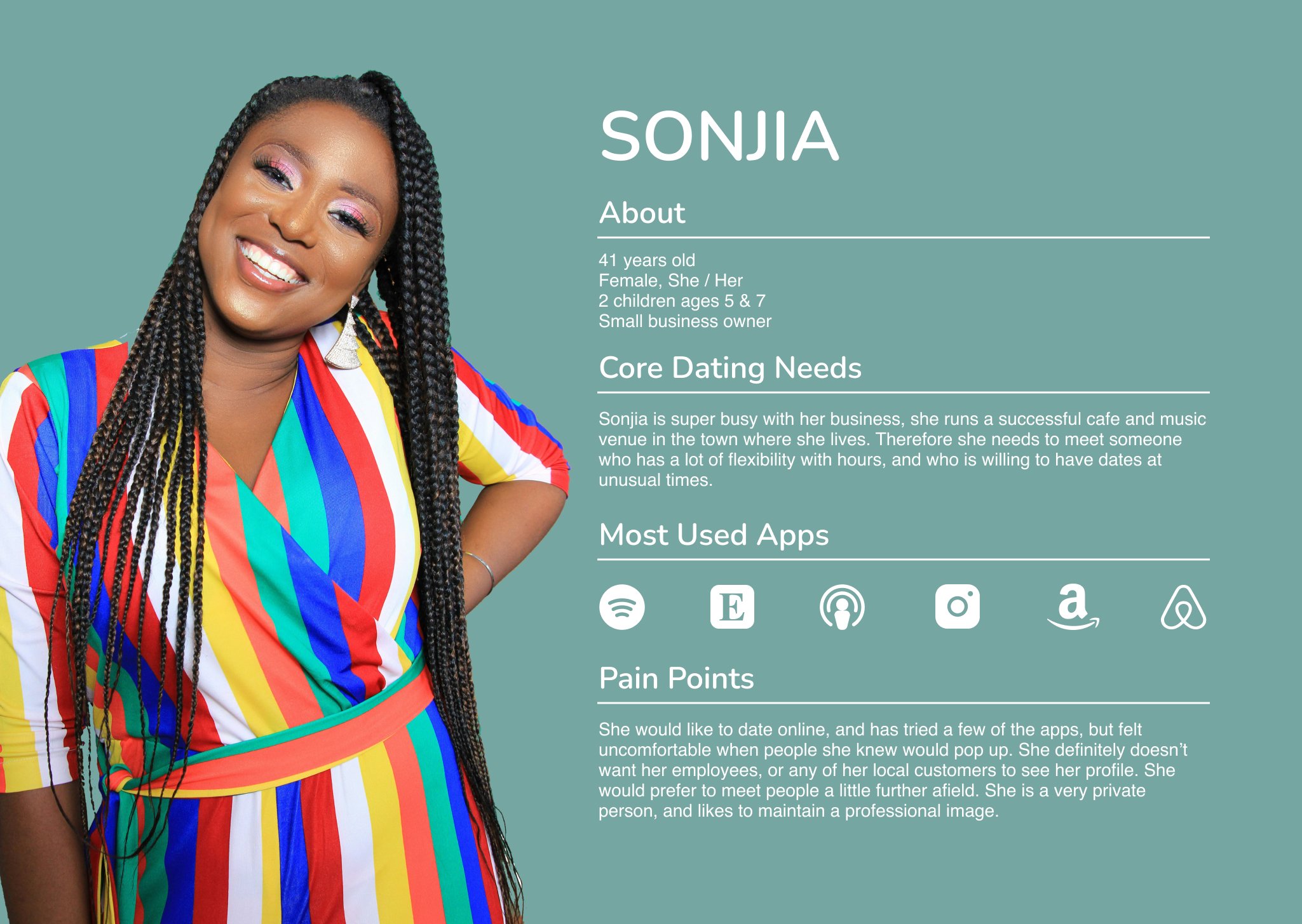
Storyboarding Sonjia’s experience
A quick storyboarding exercise helped to clarify how the ‘Donut’ feature might solve problems for Sonjia.
Information Architecture
I analyzed bumbles site architecture, and the 3 new features I am proposing will not disrupt the existing order, they can be added into the ‘narrow search’ layer. For more clarity I mapped out a user journey, to see how the feature/s would be implemented.
Site map, showing new features
User Journey, demonstrating 2 new features
Hi Fidelity Mock Ups
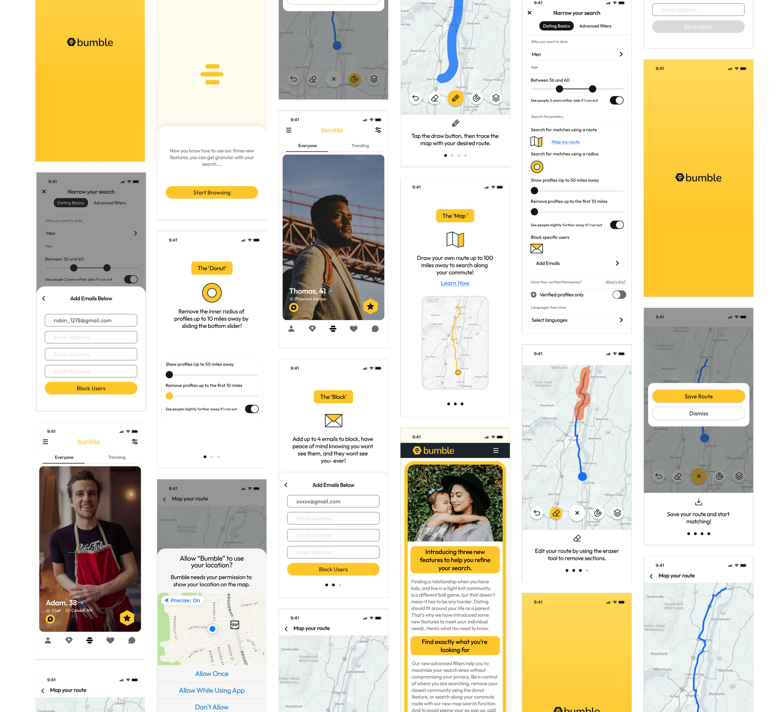
Figma Prototype for testing
The video below demonstrates the 3 added search and block features in action. click anywhere in the video to begin.
Usability Testing
The new features were tested on 5 users, and one focus group of 6 people. They were asked to complete the following tasks.
Understand the functionality of the donut slide feature, and to set the inner radius to 10 miles.
Understand the functionality of the map route feature.
To edit the route, and snap to map.
To save the route.
To add emails to block users from showing up in feed.
Usability Test Results & Iterations
In the preliminary tests I conducted, I was getting a very high success rate, all participants were able to understand how to use the new features. However, I had chosen people who were in my target audience, some of whom had been interview subjects and they had a good understanding of the problem I was trying to solve. I also realized in retrospect that I was providing a lengthy introduction to the tests, and I wondered if I was unconsciously leading my subjects and biasing the results.
I decided to test the features prototype on a random test subject group, this was a group critique in Design Lab. The results quickly revealed several weak spots.
Firstly, no-one in the group used dating apps. I had to backtrack and explain the problem I was trying to solve in greater detail.
Secondly, we were running short on time, so the participants had to act quickly.
Finally, I wasn’t able to see them using the prototype through screen sharing. I had to rely on their ability to navigate and understand the features without any guidance.
After this round of tests, It was evident that the additional features needed to stand out more in the UI to be discovered. I had used bumbles UI so succinctly that they blended in- almost too well, and were easily passed over. Additionally the second group didn’t grasp the linear map search function, and needed further explanation. There was some additional confusion due to UI copy, and one action that was mistaken for a notification.
In the next iterations I addressed the above issues, and weak spots.
1. Feature Introduction.
Initially I had no introduction to the new features, during testing if I didn’t explain them upfront users didn’t really understand what their purpose was. I created an overview of the features, with introduction screens for each added feature.
2. Map Feature Onboarding.
During testing the map search feature created a little more friction for new users than the other two features. I created an onboarding flow to demonstrate how to use the finger drag function, to help reduce confusion.
3. Edits to the ‘narrow search’ screen.
BEFORE
I adopted bumbles UI for the addition of the new features.
3 participants felt that they were too hidden, especially the map search function. It was suggested that new features should be in the spotlight, at least for a period of time while the user familiarizes themselves.
AFTER
I consolidated the features into one content block to keep them together for impact.
I added icons with color to draw the user to the features.
4. Edits to the ‘Save Route’ pop up.
BEFORE
4 participants missed the opportunity to save their route, and kept hitting ‘Dismiss’ when I asked them what they were experiencing, they all explained that they thought it was a notification, letting them know the route HAD been saved.
AFTER
I edited the the ‘Save Route’ dialogue to become a primary button, and left the ‘Dismiss’ as a secondary button in white.
I edited the copy for the screen to just say ‘Map your route’ previously it was lengthy and caused some confusion.
Conclusion and Next Steps
During this conceptual project I had the opportunity to understand the complications of dealing with a sensitive topic in a smaller community. The features that currently exist in the free version of bumble are very binary. I understand that premium features entice users to pay, and therefore are good for stakeholders and business, but nearly all of my interview subjects were not interested in paying for a subscription service to unlock them.
I believe that everyone has the right to choose how their personal information on a dating app is shown, and to whom it is shown. In small towns there is a large overlap of groups, from work and other community services to childcare and schooling. Adding these 3 extra features could allow users to feel more confident about using bumble, and ultimately have greater success at finding a suitable match.
During testing the feedback from my user group was very positive, especially with single moms, who prioritize feeling safe and would prefer not to date locally. There was more enthusiasm than I initially predicted, especially for the linear map search feature. Residing a commutable distance from a big city such as NYC a lot of users travel along one route several times a week. It would make sense to view profiles 80 miles south, but not 80 miles north.
Next Steps, I would conduct another round of usability tests to validate wether the pain points exposed in my first tests had been addressed sufficiently. Additionally I would like to brainstorm how AI could offer a solution to this problem. It could be interesting to see if adding an AI element could help narrow the search parameters even more, and populate users with more accuracy.