
Eco-Therapy
A Case Study on how technology can inspire greater connection with nature, and in the process alleviate the symptoms of anxiety and depression.
-
Student Project – User Research, UI Design, Visual Design, Brand design.
-
End to End Application
-
4 Weeks | 80 Hours
-
Figma, FigJam, Photoshop, Illustrator, Zoom, Discord.

Background
As a longterm sufferer from anxiety and depression, my search for effective treatments has been exhaustive throughout the years. During the Covid 19 pandemic when the world as we knew it completely shut down, I was compelled to seek outdoor spaces with few people, and found an unexpected ally. Regularly hiking the rivers, hills and forests of upstate New York, I found the effects of being in nature to have an invigorating and calming effect on my mood. Despite being in the middle of a global pandemic I was discovering joy, feeling physically stronger, and experiencing far less anxiety and depression than ever before.
I began researching evidence based theories on how regular exposure to nature can promote general wellbeing and discovered a universe of supporting evidence. One concept that I stumbled upon, a Norwegian philosophy called ‘Friluftstliv’ (the outdoorsy cousin to ‘Hygge’) which literally translates as “open-air living” resonated with what I had been experiencing. Friluftsliv was popularized in the 1850s by Norwegian playwrite and poet, Henrik Ibsen, who used the term to describe the value of spending time in remote locations for spiritual and physical wellbeing,
Nowadays in nordic countries ‘Friluftsliv’ is practiced daily and can count as a walk in your lunch break, cycling to work, or more ambitious activities such as kayaking. Workplaces prioritize time for their employees to spend time communing with nature.
A growing number of studies have shown that visiting green spaces and being exposed to natural environments can reduce psychological stress, and promote a sense of belonging to the wider world. Natural environments have been linked to attention restoration theory (ART) and there are studies to show that patients who undergo surgery recover quicker if they have a window view of nature and green space. Studies have also concluded that a 60 minute walk in nature can-
Reduce blood pressure, stress, muscle tension and cortisol levels.
Lower the activity in the parts of the brain that are linked to negative rumination.
Boost creativity and inspire Awe.
Boost feelings of happiness, wellbeing, generosity and empathy.
“ in a study of 20,000 people, a team led by Mathew White of the European Centre for Environment & Human Health at the University of Exeter, found that people who spent two hours a week in green spaces — local parks or other natural environments, either all at once or spaced over several visits — were substantially more likely to report good health and psychological well-being than those who don’t.”
If the answer to reduced symptoms of anxiety and depression, and an increased sense of purpose and creativity can be as simple as visiting green space, then why aren’t people in the west doing this more? According to studies by the EPA, Modern Americans are spending an average of 90% of their time indoors. The Disconnection from the natural environments we once used to work and play in, is detrimental to our mental health, and also for that of the planet.
Design Process
-
![]()
1. EMPATHIZE
Competitive Analysis
User Interviews
Descriptive Research Online
-
![]()
2. DEFINE
Interview Synthesis
Persona Creation
Affinity Mapping
-
![]()
3. IDEATE
Information Architecture
Sketch
Low Fidelity Wireframes
-
![]()
4. PROTOTYPE
Style Guide & UI Kit
High Fidelity Wireframes
Final Prototype
-
![]()
5. TEST
Usability Testing
Feedback Synthesis
Iterate


Competitive Analysis
Before conducting interviews I began researching what products exist where there is some cross over of wellness, and the outdoors. It was difficult to find any, there were however plenty of habit forming / tracking apps, meditation apps, and on the more data driven side route planning and plant identification apps. I ran a swot comparison on 4 different apps, looking at features, patterns, and value proposition.


User Interviews, Key Takeaways
I interviewed 6 people, ages ranging from 25 to 58. All are middle class American, and most living in Upstate New York. Time permitting I would have liked to have interviewed a broader sampling of ethnicity, economic status and diversity of location, such as densely populated areas, and other countries. Below I condensed the interview results into key takeaways.
“ Personally I wouldn’t like to hug a tree, I prefer to listen to the wind in the leaves ”
My initial idea of a tree hugging gamification app felt too narrow, given that nearly each interviewee cited completely unique ways they preferred to interact with nature. It was wide ranging from people who loved to get down and dirty, and others who preferred a more gentle approach. I began to brainstorm the different ‘tasks’ needed to have the widest appeal.
“ I get so annoyed with my apple watch telling me to stand up all the time “
About half of the participants saw some value in tracking progress, and expressed an interest in data that showed them how much time they were accruing in the outdoors. Most however weren’t overly motivated by milestones or badges. Probing a little further, users explained some of the apps they currently use already featured heavily in this area and that they found them annoying, or just uninteresting and even distracting.
“ I would be inspired to explore more SEEING beautiful photographs of the environment ”
5/6 interviewees mentioned that just seeing pictures of nature had a calming affect, and that illustrations would perhaps feel less inspiring. Interviewees mentioned that they would feel motivated to explore if they saw beautiful photographs of landscapes and nature. Looking back on some of my general research there is evidence that surgery recovery was faster for patients who had a view of nature.
“ EVERYTHING IS SO CONNECTED, I DON’T need TO KNOW what MY FRIENDS ARE DOING EVERY MINUTE OF THE DAY”
All participants expressed that they would not be interested in sharing progress with friends, or having the ability to ‘team up’ for incentive. The preference was to keep progress a personal goal. I was in agreement that a sharing and social feature would complicate an MVP, and furthermore distract from the mindfulness intent of the product.
iNTERVIEWees favorite apps
HABIT TRACKING & BUILDING APPS - (Apple health watch, Nike Training, Plant Nanny, Walkr)
ROUTE PLANNING APPS - (Garmin, Komoot, All Trails, Ordnance Survey, Strava)
WELLNESS & MEDITATION APPS - (Calm, 10% Happier, sound machine apps)
Defining The Problem
How might we ADOPT technology to encourage small increments of time spent outside, to develop an ‘eco-dosing’ habit, AND to ULTIMATELY help users experience greater equanimity?
After looking at existing products on the market, and speaking to interviewees on the apps they used to enhance their leisure time outside, I noticed that they tended to focus on either exercise habit formation, or performing more granular tasks such as route planning, and health data reporting, but none acted to motivate a user to physically go outside.
The problem from my perspective after conducting my research, wasn’t that people didn’t know that being outside was good for them, it was more that they felt too busy to accomplish it. Additionally the size of the task seemed to overwhelm and intimidate them, the experience was being perceived as a grandiose undertaking (a long hike, a drive to the ocean, camping etc) when in actual fact nature is everywhere and accessing its benefits can and should be much simpler.
I began to consider what gaps there might be in the market for a wellness app that avoided being too preachy, and simply encouraged people to step outside for even small moments of time, something akin to micro-dosing nature.
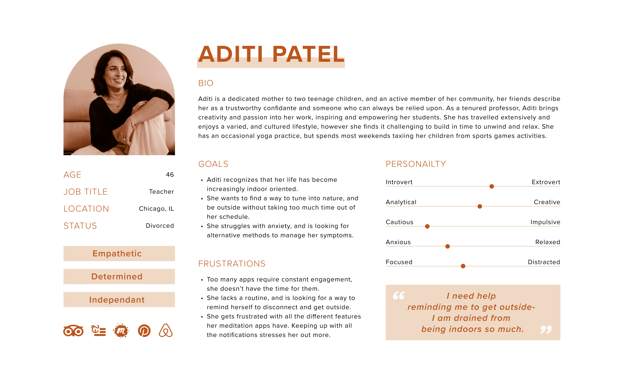
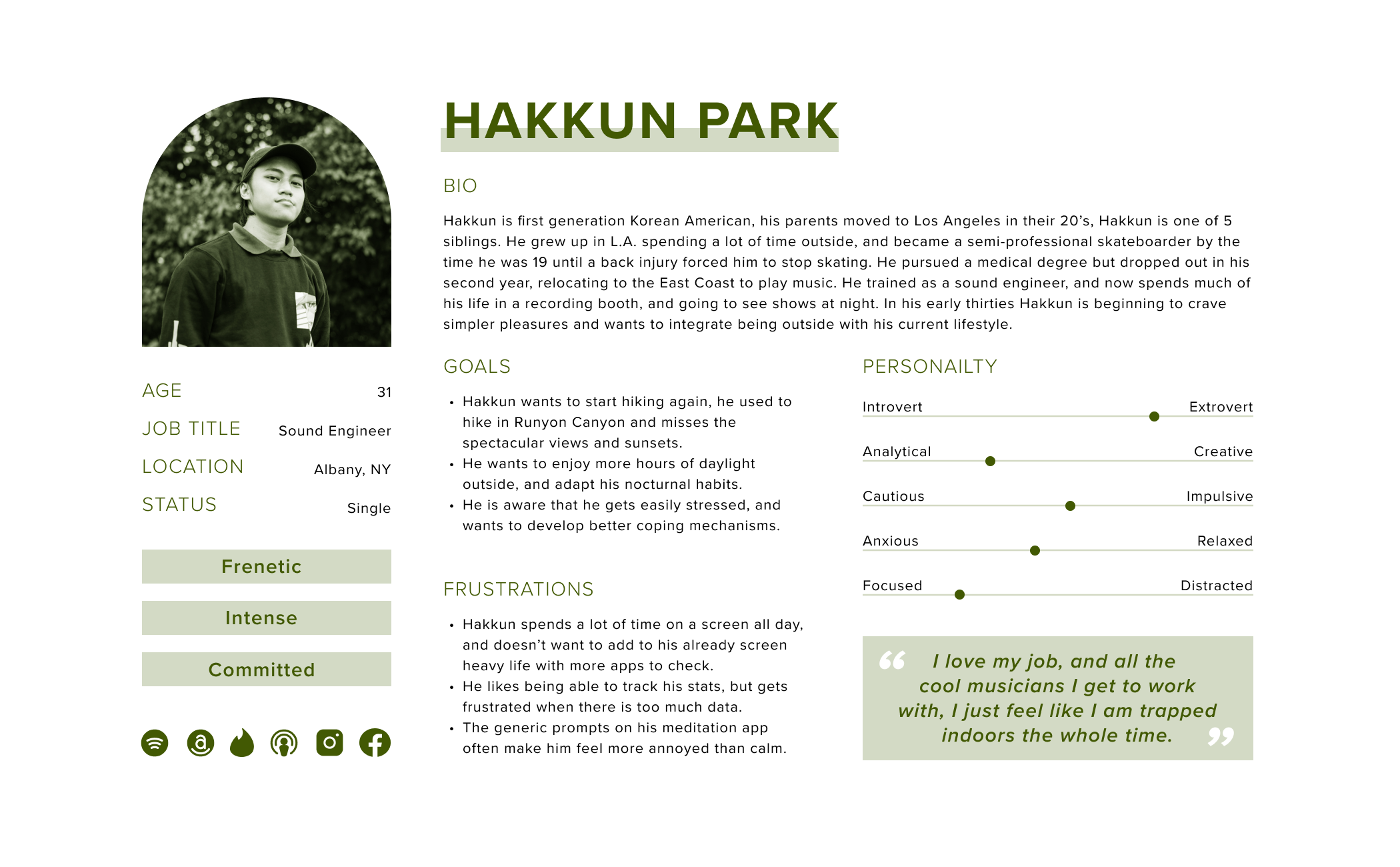
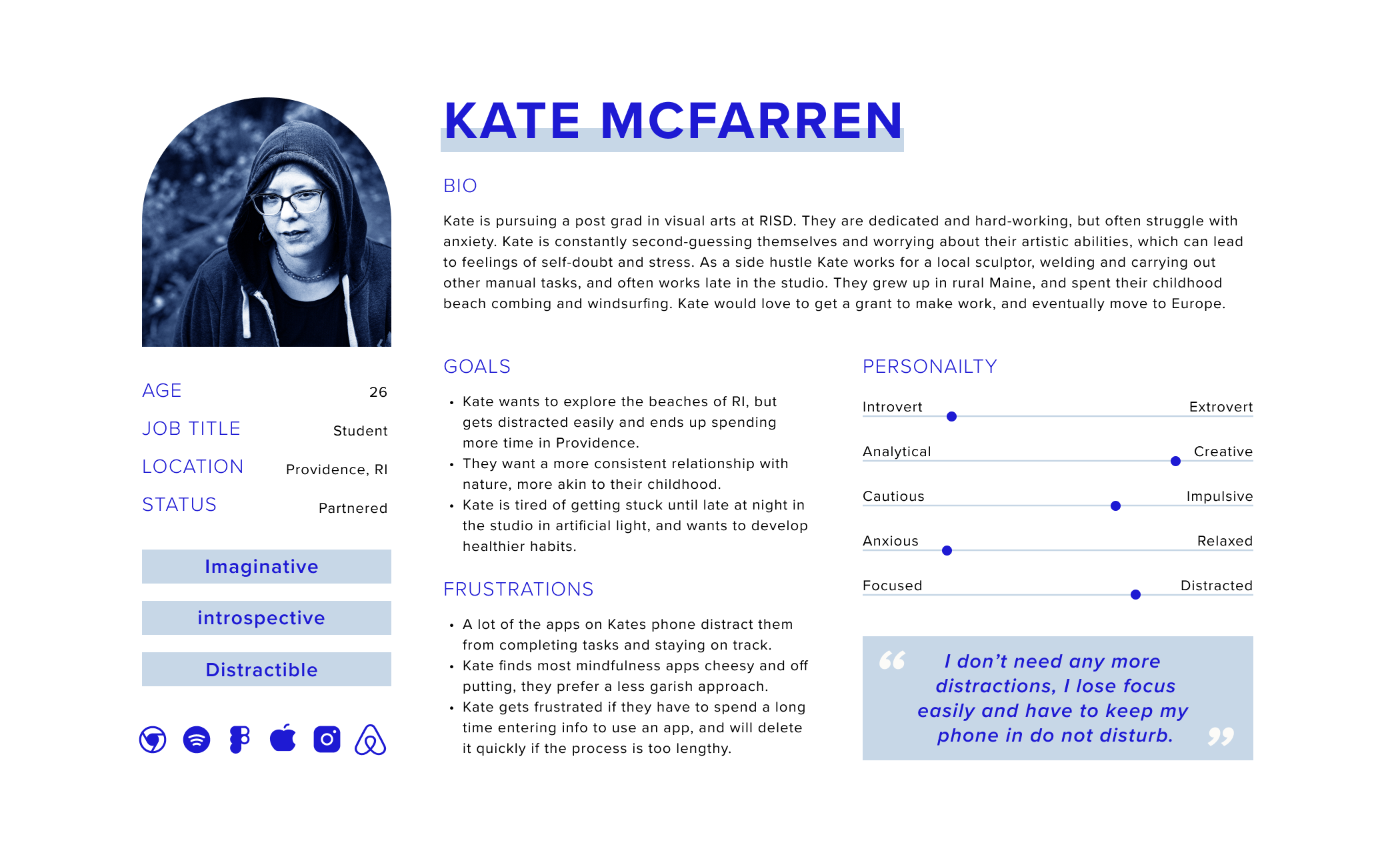
Personas
The personas helped me to visualize the needs and challenges of my customer base, and ask valuable questions. It helped me address the various pain points, and motivations behind wanting to shift mindsets and develop a habit of being in nature.
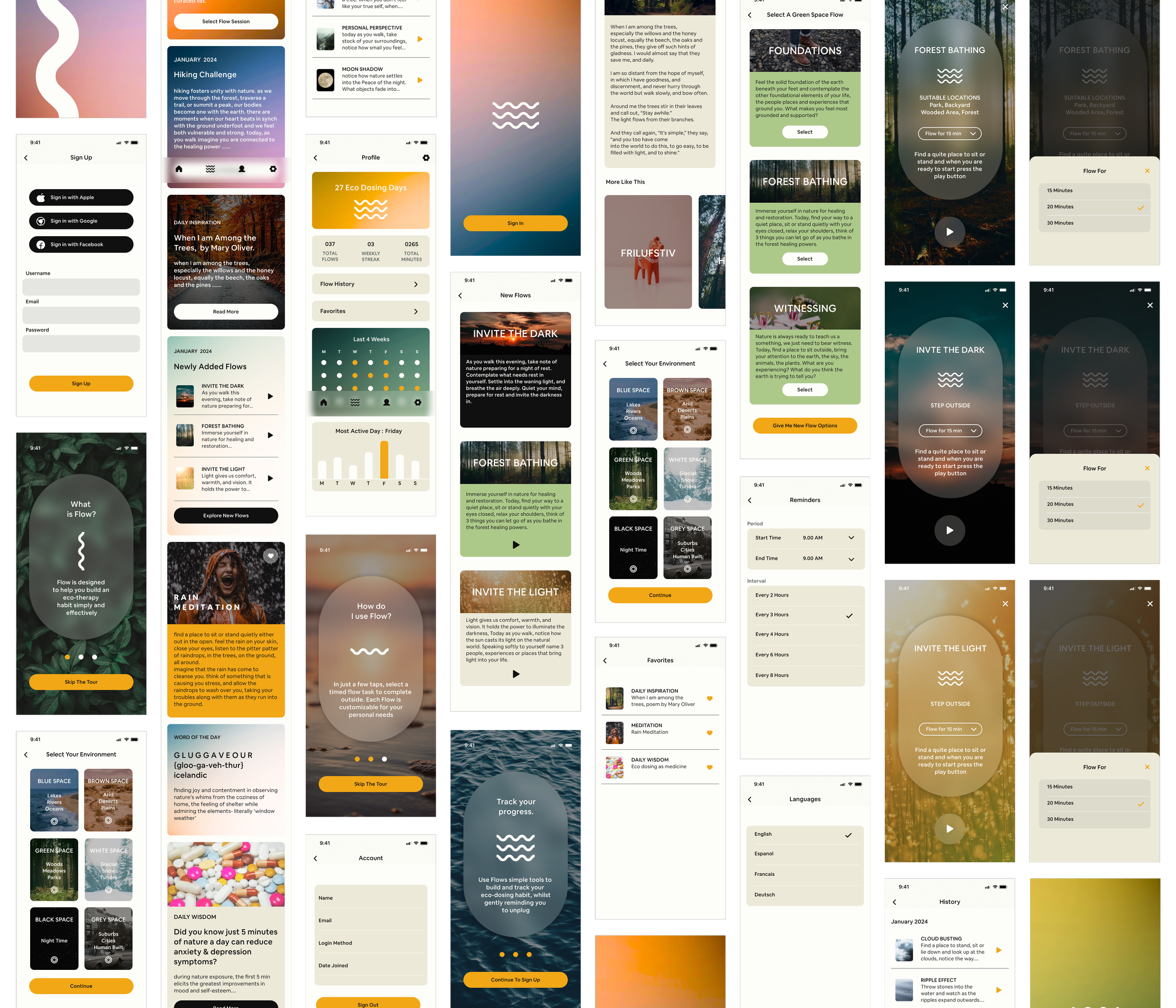
Sketches & Low Fidelity Wireframes
Sketching the information architecture helped to work through some of the basic functions the MVP would need to perform and what screens would be necessary to complete the task I had in Mind.
CHALLENGE - How can a product cater to the wide variety of environments and seasons a user may be experiencing?
SOLUTION - Providing the user options to curate their meditation activity by first selecting their outdoor space, which would in turn populate a list of appropriate choices. I defined 6 different environment types that (hopefully) cover all scenarios of weather, and location- Blue Space for bodies of water / Brown Space for arid and hot conditions / Green Space for woodland, or suburban backyard spaces / White Space for snow and wintery conditions / Grey Space for urban and city environments / Black Space for nighttime.
CHALLENGE - Not everyone has a lot of time to spare in a busy schedule. How could the product deliver small doses of time?
SOLUTION - Adding in the ability for the user to select the duration of the session would provide autonomy, and flexibility.

CHALLENGE - Habit tracking and streaks weren’t a priority, but my research showed it did help to motivate some users. How could this feature be present and yet discreet for others?
SOLUTION - I decided to include a profile that was focused solely on stats, this way if a user is interested there is a good overview, with more granular breakdowns, and if a user is disinterested their experience will not be bombarded with notifications and goals.
CHALLENGE - How does an MVP with minimal features offer enough options to keep the user engaged and returning for more sessions?
SOLUTION - After researching some walking meditation books and card decks, I was able to identify a formula that combined a simple task (collecting leaves, counting stars etc) and a thoughtful question, this will encourage the user to get present with the experience of being outside and take note of the subtle changes happening around them. Additionally a section of ‘newly added flows’ that would appear on the homepage offers newness each time a user opens the app. I also designated the home screen to act as an information center, with articles, and inspirational content.
MVP Feature Set
For the Flow MVP I focused on the most basic pillars of function to achieve the habit building I would like to encourage. These were centered around the flow exercise for minimum distraction, some complementary information and articles, and some statistics available to those who would like them. In the later releases social functions, geo locating, and even plant identification would be fun to add depth and texture to the experience.

Information Architecture
When it came to building the architecture of the Flow app, I referred to my wire-framing and played out some user journeys to make sure I was capturing the necessary screens. Nesting the various features and functions under sub-headings provided the foundational architecture for the app.
Site Map
USER JOURNEYS
Design System & Brand Guidelines
Taking into account my user research, and comparing the UI of existing products, I decided Flow should have beautiful photography, and yet incorporate simple graphic elements that complimented and not competed. I Developed a soft ombre to bring warmth and texture to the UI. The simplicity of the Flow logo, allows for it act as a knockout, or a fill. Subtle blurs and drop shadows also help to define elements and buttons, whilst a crisp font was chosen for its clean lines. The palette needed to also remain simple given that a lot of color would be coming from photography, I adopted a soft grey, off white, and black for the majority of text and used an accent yellow to draw attention to CTA’s and other active states.


Hi Fidelity MOCK UPS
Arriving at the High Fidelity mock-ups was my favorite part of the journey. I leant into Figma’s Auto layout, components, and animations. This bought the app to life with interactive elements.
Flow Interactive Figma Prototype
When building the prototype for Flow, I wanted to add video but due to technical constraints, I wasn’t able to do so. I pivoted to creating a series of animations for the onboarding, and making ‘bounce’ interactions for button pressed states. This really added to the sophistication and sense of the app being a real product. Click anywhere in the phone below to start or pause the video.
Usability Testing
The Flow prototype was tested on 5 users, they were asked to complete the following tasks.
Complete onboarding, create an account, understand the home screen content, and the main intent of the app.
Navigate to the ‘Flow’ sessions, selecting a green environment, with a flow duration of 20 minutes & complete.
To sign out and / or delete the account. To explore the settings page.
To navigate to the ‘Flow’ session history log, the favorites archive, and the ‘New flow session’ page.
Explore the profile and understand the statistics displayed.
5/5 test subjects were able to complete the tasks with little to no friction. However there were some task flows that created some confusion and needed simplification. Additionally some clearer UI copy was needed to set expectations and reduce friction.
1. Edits to the Homepage Sequence of Cards
BEFORE
Several participants were confused by the purpose of the home page (the user is dropped into this page after signup) I had to explain that these were articles and information related to Eco Therapy.
1 participant felt strongly that the option to go straight to the meditation section made more sense, especially if it was a new user.
AFTER
I agreed that there wasn’t much to set a user’s expectation, especially if this was the first time they were using the product.
I added a card to the top of the homepage that gave a basic introduction, and a CTA that navigates the user directly into a flow cycle.
2. Edits to the Duration dropdown and Hierarchy
BEFORE
Watching users navigate through the meditation flow, I felt that the duration selection screen added friction and slowed users down.
Initially part of the ‘Build Your Flow’ sequence, I felt this was not hierarchically appropriate for this feature.
AFTER
I removed the Duration screen entirely, and embedded a dropdown option in the meditation prep screen with a preset time of 15 minutes.
The dropdown now triggers a pop up to edit the flow length in the same screen.
3. Edits to the Environment Selection screen & process.
BEFORE
2 participants were confused by the ‘Build Your Flow’ copy, and the secondary titles.
3 participants felt that the ‘Select’ button on the environment options was misleading. They had an expectation to be taken straight to the next screen.
AFTER
I consolidated the headings into one title that described the action on each screen for the user to take.
I edited the environment cards from a carousel to fit the options on one page for easier viewing, and replaced the ‘select’ button with a radio button.
4. Edits to the Flow Meditation Screen.
BEFORE
Some users felt that it wasn’t clear that they were in the green space environment meditations.
2 participants felt that the ‘Select’ buttons were misleading, and had an expectation to be taken directly to the next screen.
4/5 participants commented they would like the option to populate new meditations in the event they didn’t see one they liked.
AFTER
I edited the color of the flow meditation cards to green and changed the title copy to say ‘Select A Green Space Flow’ Thus omitting the need for the second title.
I replaced the ‘Select’ button with a simple play button.
The CTA now gives a user the option to populate new flow meditations as many times as they like until they find one they like.
Conclusion and Next Steps
The reception of the Flow product was very positive, test subjects saw value in the proposition and liked the gentle approach of the intent. I enjoyed the design challenge I faced, keeping the UI elegant but also adding interest where possible without overwhelming the user. Simple animations were fun to create in Figma, and there is a lot of detail I would have loved to add, but was unable to due to both time and technical constraints. Some of these would have been more sophisticated animations, and adding video elements.
Some users requested the option to have audio, I would definitely find a way to add this in another iteration, audio would be especially beneficial for completing the meditation, being optimal for user to hear the instruction as opposed to reading it off a screen.
I didn’t get a chance to design for accessibility but I am aware that my product doesn’t provide enough provisions for people who have poor sight, I did remain diligent in making sure contrast, font size and weight were legible. In another version I would spend more time testing this with different groups and people with compromised faculties, and look into how I could add more audio, or different options for color blindness.
As this is an MVP it has very simple functionality, and I focused very deliberately on completely one task from start to finish. In future iterations I would look into adding some more features such as the ability to create your own flow mediations and more sharing / community features. Some light gamification would also be a nice to have option.