lucea
Logo Suite
Color Palette
Visual Language
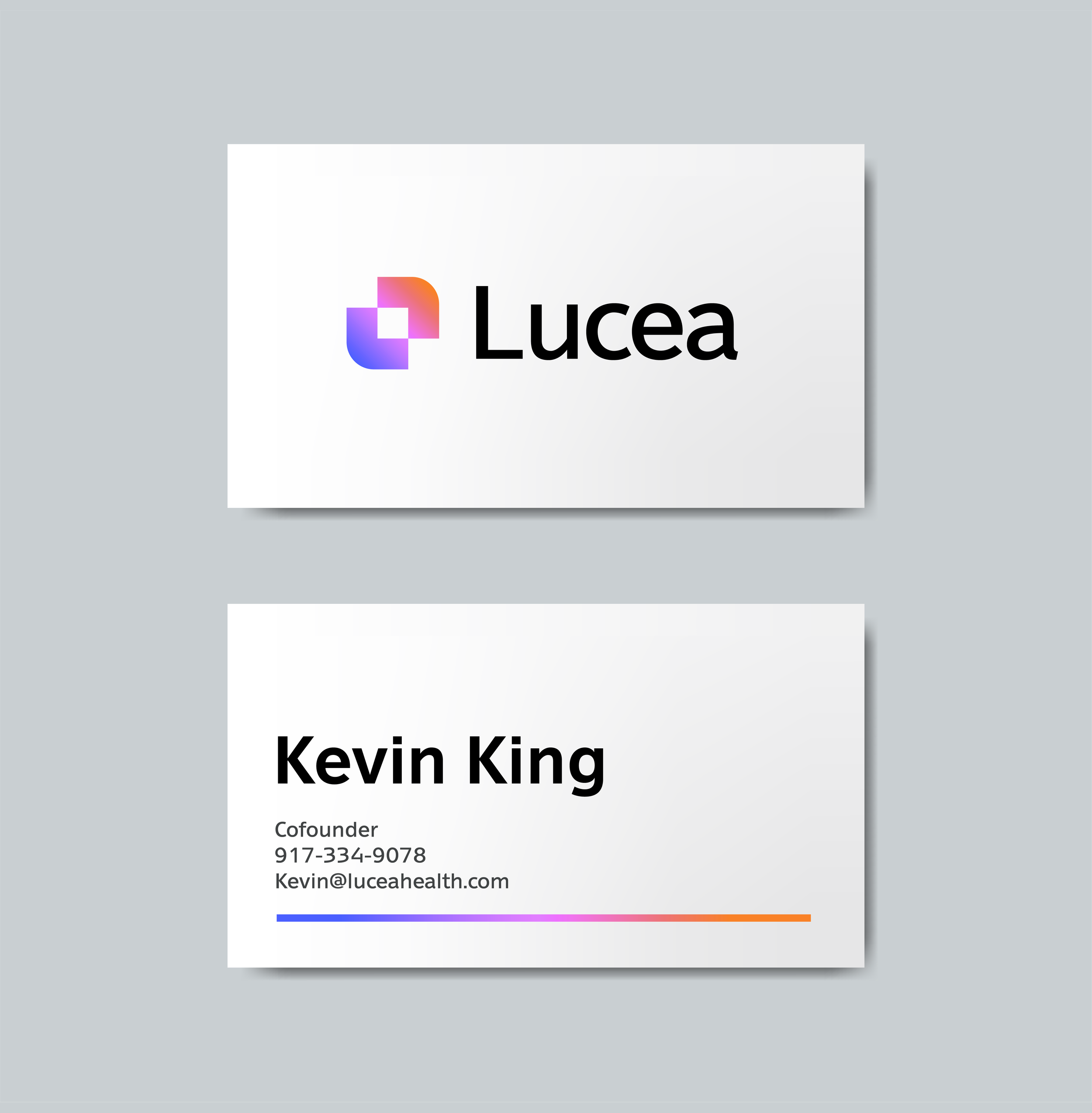
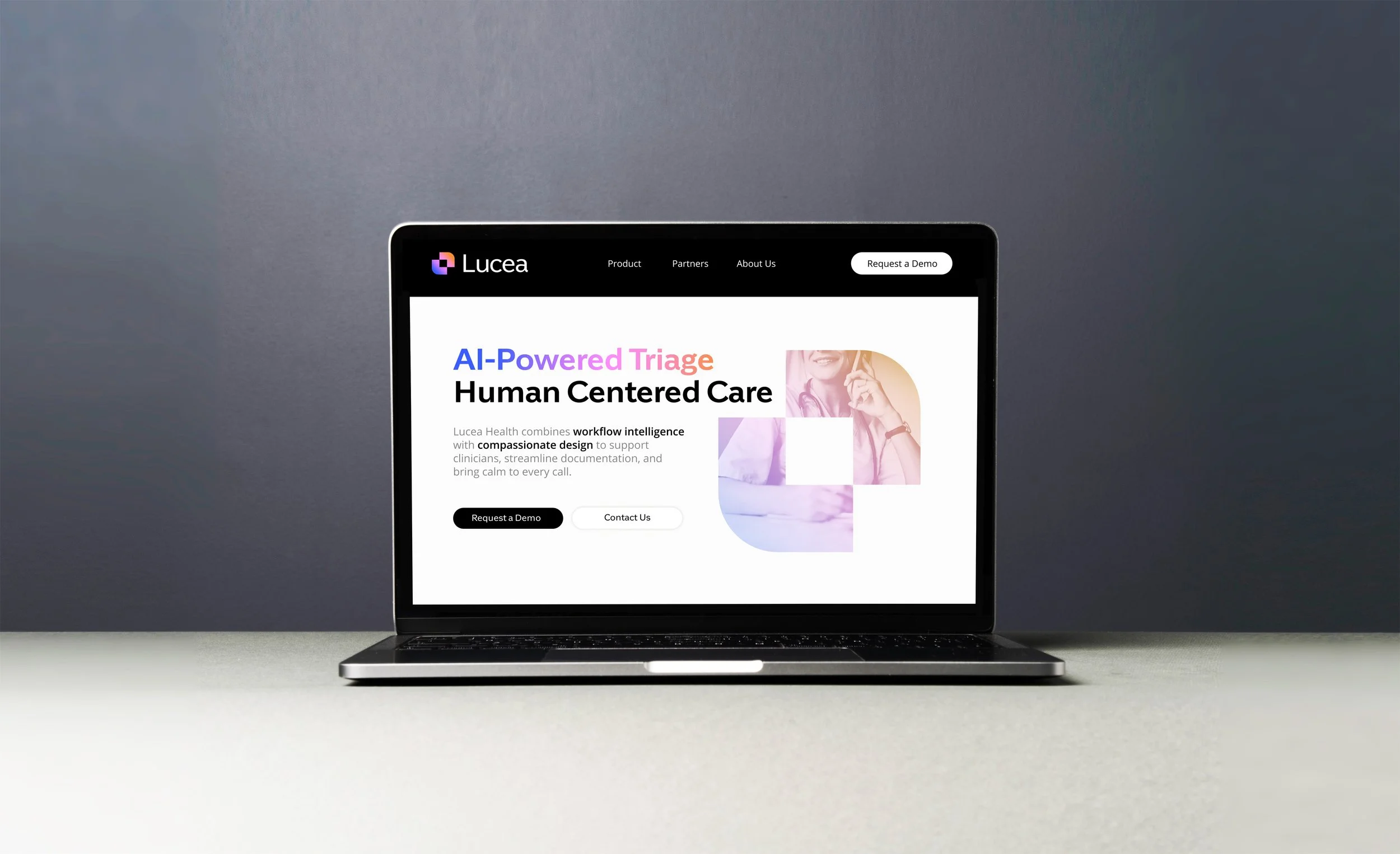
Lucea was founded by pediatrician Caitlin King and healthcare technologist Kevin King, who saw firsthand how inefficient triage drains time, energy, and joy from care teams. Together they are reimagining pediatric triage through the lens of AI- bringing intelligence, empathy, and trust to every interaction. They needed a starter brand identity designed to convey friendliness and dependability to the families and care teams they serve.
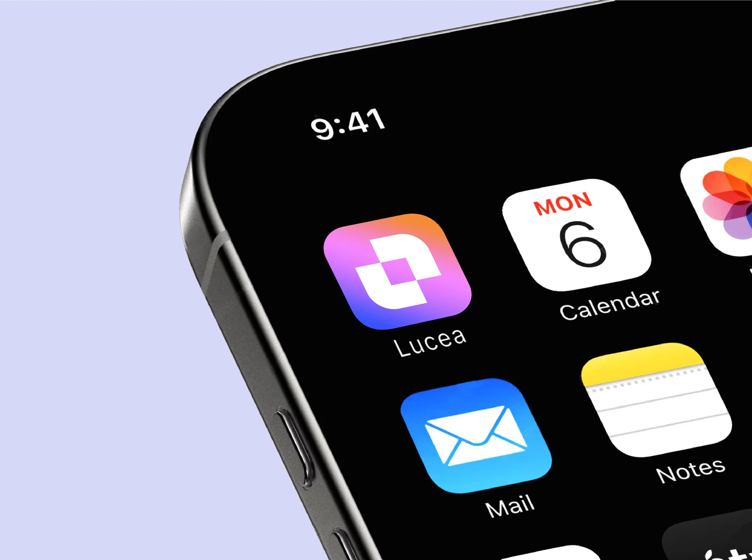
Lucea primarily means "light," derived from the Latin lux and Spanish luz, and the design concept flows naturally from that origin. A spectrum of color runs through the identity, symbolising refracted light and the warmth it carries. The logomark is formed from two interlocking L's that together create a rounded square — a portal-like form designed to feel like a container, symbolising the care and support that sits at the heart of the brand.